A logo I'm ok with (so far)

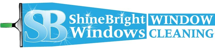
So last couple I weeks ago I designed my logo. It’s about time too. The reason being was (and this is funny) I did not want to use a squeegee or a fan or even a squeegee swipe. Ironically I had to break down and incorporate the squeegee and wipe. But hey this works for me. I did however stay true to my font. I created it all from scratch using Adobe Illustrator.
I used to be a graphic designer by trade until recently so I have all the software I could ever want. Not to mention I can have anything printed at lower than wholesale printing costs . A benefit to me because printing ain’t cheap. Anyway. My logo. Tell me what you think.


Sent from my iPhone using Window Cleaning Resource

very sparkly,…

Bling Bling

Sent from my iPhone using Window Cleaning Resource

Looks nice. I’m by NO means an authority, but having “windows” and then “window cleaning” in your business name seems a little redundant. Maybe remove “windows”? Other than that, I think your logo looks great!

Jesse
Atlas Window Cleaning
North Carolina

Yea that does kinda bug me too. It’s just that I need them to know what Shinebright windows does. I get a lot of calls for replacement.

Sent from my iPhone using Window Cleaning Resource

Yes an put window cleaning under shine bright . I like it I’m not an authority either just saying

Sent from my iPhone using Window Cleaning Resource mobile app

Oh. And I can’t remove “windows” because it’s part of my name.

Sent from my iPhone using Window Cleaning Resource

Can you make the SB the same size as the. Shinebright windows then put window cleaning underneath. Just an idea

Sent from my iPhone using Window Cleaning Resource mobile app

There is already someone called “Shinebright window cleaning”

Sent from my iPhone using Window Cleaning Resource

In that case, I would do what Majestic said.

It’s funny, I was gonna say you might end up getting a lot of calls for replacement.

Jesse
Atlas Window Cleaning
North Carolina

Can’t make the SB the same size as Shinebright. Due to the difference in letter quantity. If I make the SB large and Shinebright winders under it, no no no. It will change the entire thing. lol. I like how there’s some depth to the way I have it. Hmm.

Sent from my iPhone using Window Cleaning Resource

I just think wimdow cleaning looks out of place. I think it was [MENTION=1377]Bruce[/MENTION] that said you don’t even need window cleaning in your logo .
I like it though I like the SB an I like your name. Play with it do different things I mean it works the way it is .
Sent from my iPhone using Window Cleaning Resource mobile app

I think you may be right. I could replace the “window cleaning” with a glass pane icon and keep the depth of the image that I like.

Sent from my iPhone using Window Cleaning Resource

The purpose of a logo is only to identify you, not explain what you do. Your marketing should do that.

Another thought about what you wrote in your initial post: If your initial intention was to avoid a squeegee, I think you should stick with that idea and keep working on it.

Your friends are right. I cropped it for you. Simple,clean and bright.

It reminds me of the flags that fly behind the little airplanes that fly up and down the beach in the summertime. Real long.

[MENTION=6510]Tim4[/MENTION]
Reminds me of a song my wife listened to a lot by Rihanna.

Actually [MENTION=12488]shinebright[/MENTION] I think your slogan should be;
[I]Shine bright like a diamond! [/I] :cool:

That’s funny cause I always say when something shines, that it shines like a diamond in a goats ass.

Sent from my iPhone using Window Cleaning Resource

Yea I’ve been thinking too long as well. Thanks for the input.

Sent from my iPhone using Window Cleaning Resource

Yes but there’s still something missing.

Sent from my iPhone using Window Cleaning Resource