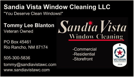
I tried fiverr, but so far I’m striking out. I just put this together and ordered 500.
I tried fiverr, but so far I’m striking out. I just put this together and ordered 500.
I like your slogan!
Wondering… What happened to your cool swirl logo?
http://windowcleaner.com/t/logo-rough-draft/39564/116?u=wvwindowwashing
I don’t like it. Too much information on it. It would look better if you split the info between two sides.
That was my first impression too tbh. You could proly nix the business name you have on top in white since it’s already in the logo. The “veteran owned” and the vet owned logo are also redundant; keep one, drop the other. Finally, noone is going to contact you by mail so do you really need your mailing address on it?
Just some thoughts.
Great, thanks for the feedback. I will make some changes. I was going off Vistaprint’s default entries.
Much better. Going to leave the address.
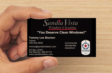
Couldn’t get comfortable with it. I liked the gray tone better and once I saw it I was hooked.
Much better
Not sure about the black, maybe try a light blue? Black is very harsh and anything to soften it up might go towards selling.
Black fits my personality!  Black truck, black business cards, and black polos (I ordered blue polos too). What I should have done is put some wheels on the card to match the truck!
I didn’t want to mention it earlier cause i thought it was enough constructive criticism for one post… But yeah, the black doesn’t feel right. It doesn’t give me the impression of clean. Remember, the idea isn’t for it to appeal to your preferences, but to your customer’s. Think of who will receive this card in your market. For instance, in my market, women aged 35 and above are my primary customer, so my marketing must be appealing to them. When designing, a technique professionals use is to create several imaginary characters that depict potential customers and then flesh out their biography. Then, when you go to make a design choice, you ask yourself, “What would Mary think of this?” (for example). Not saying the color of your cards is make is break, but still something to think about.
Happy Veterans Day ! Thank you for your service tommy !
So if you see a red door do you want to paint it black? lol
Yeah, it’s more about how it feels. On pretty much any print website like vistaprint you should be able to play with colors and just keep changing them until your wife goes “Oh! I like that one” and then press print. ![]()
So far she’s too easy to please. She seems to like everything. She did like this logo better than the elliptical one though.
I like it (just to throw in the opinion of a mid 30s woman). My other opinion is that the next time you order cards there’s a good chance you’ll get something totally different. At least that’s how it was for us. I liked the first cards we had, but when it came time to reorder a change felt good.
Thanks! God knows I’ve received far more than I ever gave. We have a great Nation!
Hey you’re part of the reason why this country is kick ass !
If it fits keep it. You have to represent it. Don’t let a bunch of strangers on the 'net change it.
Where did you get the veteran owned logo? Gotta register to use it?
Yes, I joined the National Veteran Owned Business Association (NaVOBA) for $47 per year. I got the vector file and a large dog tag sticker as well as several smaller oval “Buy Veteran” stickers to use for advertising. http://www.navoba.com/
