Just finished my website, tell me your thoughts.
3 Likes
looks nice
1 Like
It’s a very clean looking website! Very minimal and straight to the point, which I like. Good job!
1 Like
Finished website looks really clean. That main page and the text about loving your view again is great.
I went through each page and found the two small things to consider changing. First was on the about page.
The gray block of text overlaps the picture slightly on a mobile device. On a desktop, it’s off to the right.
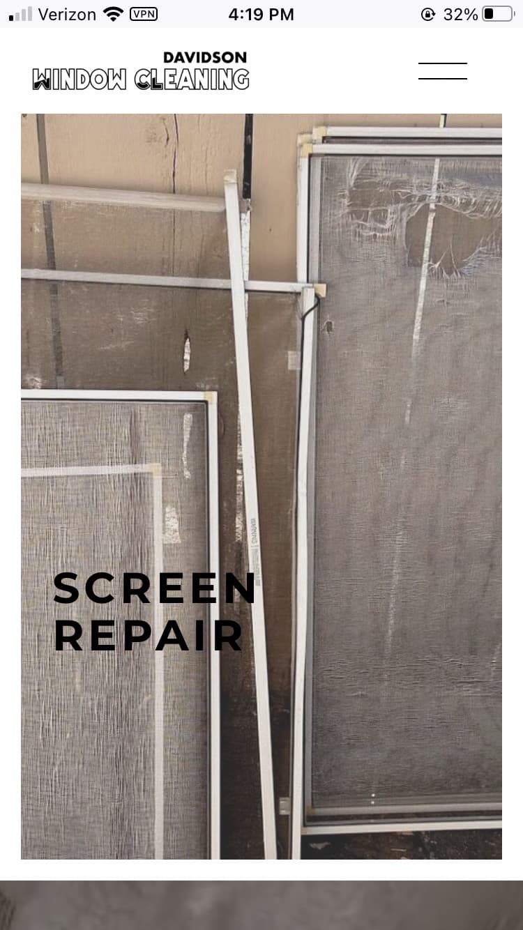
- On the screen repair picture ( under services->screen repair) the broken screens are on the right. Since most people read left to right, consider having the broken screens on the left and the repaired screens on the right. Tells the story of before and after.
Otherwise you’ve done a good job of connecting your story to TN and clearly showcase your services/expertise.
1 Like
Thanks
Thank you
Thanks for your thoughts. For the first one, I don’t have fine enough control on the template to fix that, but that said, at least on my phone, it doesn’t block us in the picture so even though it overlaps, I don’t think it’s a problem.
For the screen repair, I don’t understand what you’re referencing, there isn’t a picture of repaired screens on the screen repair page, the only picture of repaired screens is the one on the services page.
I could have been clearer.
When I click services-> then click screen repair, the next page that loads has a picture of several screens against a wall.
The placement of the screens in that image could be switched. If the screens with the big holes were on the left, and the screens with no holes are on the right, it may show your customers better the before and after of this service. E.g here’s what broken and repaired screens look like.
This point is a minor suggestion. Leaving it doesn’t take away from a solid and clean website.
Ah, but all the screens in that picture (which is 5 years old anyway) are damaged.
Looks good, but if I were you I would sprinkle contact info throughout the pages.
Other than the phone number button at the top and bottom of the page and the email at the bottom?
Yup, slap one in the middle too. Its great for conversion rates.
You don’t want to give the customer a millisecond to change their mind while looking for your contact info.
1 Like
I’ll work on that.
