J’s version is simpler, so it’s an improvement, but it is not balanced. You have a complete image at the bottom, and a smaller image at the top, with a big blank area in the top-right. Filling the top 1/2 with a larger company name might help with that.
1 Like
Just catching up now @Skipper. @JfromtheD nailed it, the mountain outline part of my logo is the same as the mountains in the picture. It’s a picture I took a couple of years ago on bike ride about 15 minutes from my house. These are the mountains that all Reno residents see every day so they definitely have meaning to us.
Let me take what you guys have said and play a bit more and I’ll get back to you.
3 Likes
Being a newer business, I’ve tried a few different color schemes with my logo. My website, argentawindows.com, looks like my card with the same picture and white logo. I’m trying to make a card that blends seamlessly into my website. The mountains are key to whole brand. The other scheme I’ve worked with looks like this:

This is the the logo on my invoices and I’m considering using it on shirts since the blue helps it to stand out. The blue still ties back into the sky of my larger scheme and website though. The silver comes into play because navy and silver are our college colors (Nevada Wolf Pack) plus Argenta is a play off of the latin argentum which means silver (Silver State).
I’ve also got a black version of my white logo I can use on light colored media.

Teach me Skip
2 Likes
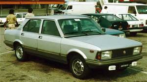 did you ever have the fiat argenta over there. they had a bad name here
1 Like
This is the logo and card you should use. Ditch the photo. The simplicity of this makes it stand out. In this case, less is more.
1 Like
Balance don’t mean shit in design.
The first example was ‘balanced.’
Yet, it looked like a mess.
Why?
People naturally focus longer on certain areas (Rule of Thirds)
In order…
- Top left
- Bottom left
- Upper right
- Bottom right
Yes, we read from left to right, but our eyes actually want to go down/back to left,
more than they want to keep moving right.
(do you ever notice how much I speak in bullet points,
and liberal use of the Return key in my posts?)
The “negative space” of the top right draws the eyes (naturally)
to the next section (bottom left)
From there, the long mountain across the bottom increases the effect.
which our minds recognize what it is from a distance,
making us focus on the top left (the LOGO) for a longer period of time.
And we finish at the bottom left (the name/phone number.)
1 Like
Your comment about balance is simply not right. Visual balance is a fundamental of graphic design.
1 Like
i read they made nearly a million of the fiat argenta-id wager that number was false info designed to make out it was better than reality. they rusted out quickly i remember that.
i think id have the argenta car on that business card though im not sure why ,might be bad luck to “ignore your bloodline”
Haha…I think I’ll stick with the bloodline that Argenta was almost my hometown’s name instead of Reno until the Southern Pacific Railroad commission decided to name it after their deceased Civil War General, Jesse Lee Reno.
2 Likes
Okay gents.
After much deliberating, wringing of the hands, beating my head against the wall, etc., I like the two designs below. I’m leaning towards the mountain pic in the end because I think it will be very eye grabbing when it’s sitting in businesses and cafes and such. One of the goals is to attract attention to itself, right?
I may end up getting 500 of both and seeing how they do in the field.
Let me know if you guys have any final suggestions and thanks again for all of your help!


3 Likes
consider gettin them in plastic. after a few yrs of really crappy cards i pulled the trigger on plastic and they never fail to impress. one person even said “are you sure i can keep this?” as if it was a credit card id handed over . thats a thought,make a card to look like an impressive ATM CARD "the GOLDen window ACCOUNT "
2 Likes
Hey Kevin every time see this thread you have new card pics up. 
Ok here’s my take on it.
I like the top one of the two (fronts)
The back looks good too, but i like @luke3636 lay out too.
Only get 500 to start unless your giving them out like free water…and before you get ride of the first 500 you’ll wanr to change it up.
As side note i like the website nice and simple to navigate.
1 Like
Bottom one is very nice. Clean, balanced and simple.
I like the front of the first one, and the back of the second one.
we use it a lot for commercial … not so much for res. It comes in real handy handed out 4 today with quotes on the back.
1 Like
Winner winner chicken dinner
