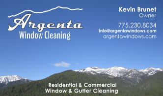
I’m ready to get these printed up but I wanted to get the forum’s opinion on my design. The back is going to be similar to what @luke3636 described in his video about business cards with a section for estimates.
I know there are always differing opinions but I would like to hear what you guys have to say.
I like the mountains…some suggestions : Lose the mountain outline over the business name, too distracting… Leave out “operator”… leave out “call or text” …Make Phone# bigger
Leave out “free estimates”…try putting your name or ph# and email in place of Friendly, professional…" etc. I don’t think that is really needed unless you had some nice catchy phrase there.
I think it is cluttered. I believe that a business card introduces you and provides your contact information. You don’t need a bunch of cluttered, small-print marketing. I would eliminate all of the bottom text. Use the space to tell them who you are and how to contact you, nothing more.
Thank you guys for all of your input. I guess my problem is that I’m trying to advertise a little bit too much on my business card and I guess I should just let the contact information speak for itself and go for a cleaner, simpler design.
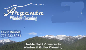
Thanks Skipper. I appreciate the honesty. I need the direction. And thank you to all for taking the time. Here’s my second attempt and both sides are shown. The back side is based off of @luke3636 's video about business cards. I like the mini-estimate idea.
I’ve posted one version with the mountain outline in my logo and one without. I would be sad to leave it out because it’s our local mountains and it’s officially part of my logo but if everyone thinks it’s too much, it might have to go.
I like the top one
The way you have the back setup is nice, you might want to add a box for other services…since you do gutters and maybe other add-on’s.