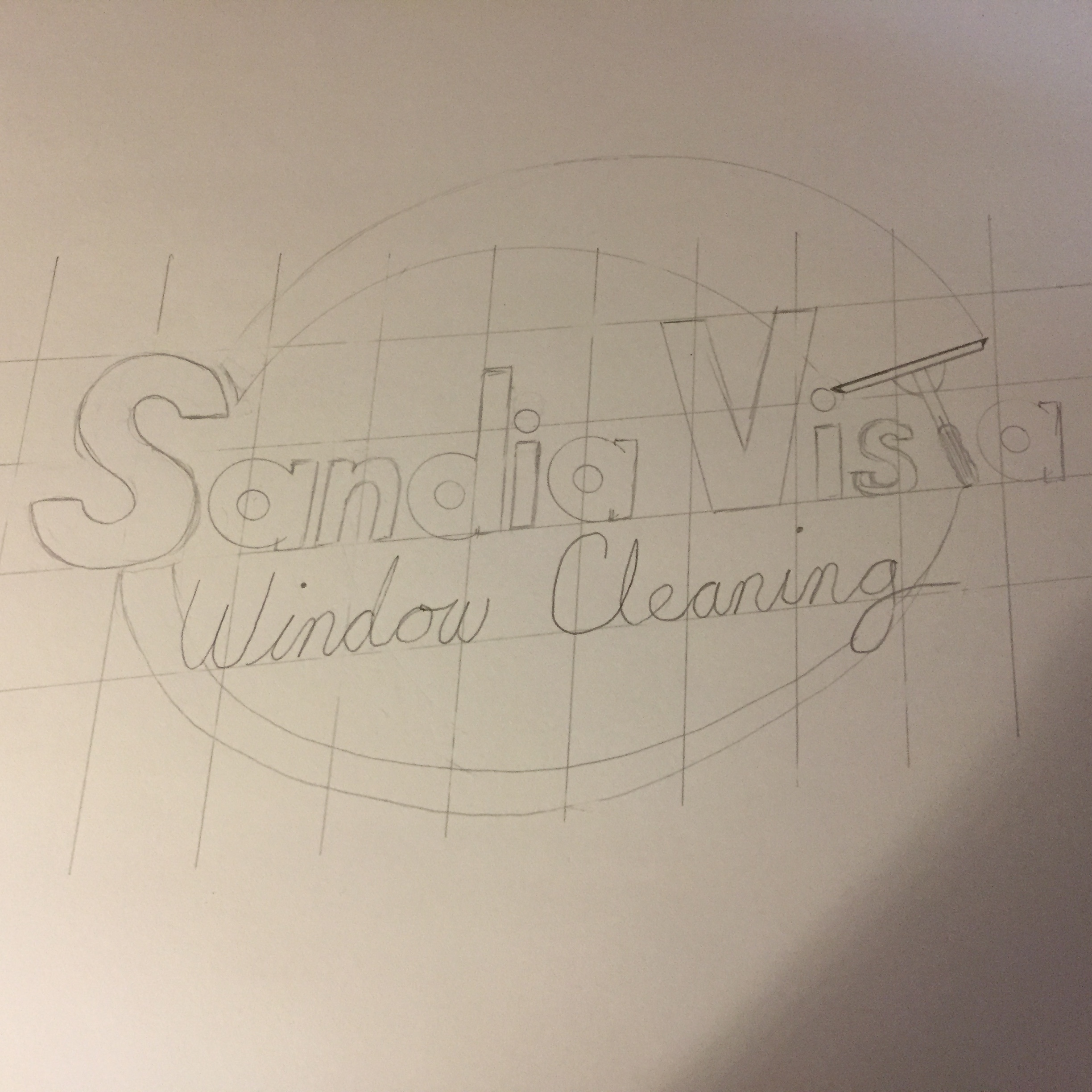
I’ve been dragging my feet on hiring someone to design my logo. I have a bit of an artistic flare that I tap into once in a while. This idea just sort of came to me. I remember reading somewhere that circles seem to have a positive effect on consumers. Granted, there is a very similar logo that you see quite often from a major multi-national company that I happen to work for, but I shit you not, it didn’t occur to me until I stared at this for a while. Who knows, maybe there was some subconscious thing at work. It isn’t perfect. I drew it free hand a couple times before spending 15 minutes on this before my daughter’s soccer practice. Any thoughts?
5 Likes
Perhaps the dots over the letter I should look like water droplets.
2 Likes
I thought about sparkles, but I didn’t want it to be overdone. I like subtle, but I’ll play with that to see if it works.
What are your colors going to be ?
1 Like
Any suggestions? I’m thinking blue lettering, with a black outlines, and a silver elliptical.
Yeah. That will look nice on a shirt. Def the blue
Silver and Blue = Dallas Cowboys colors. Definitely a good fit in NM, they are probably the hometown favorites.
1 Like
Ha! More subconscious! It’ll match the star on the front of my truck!
1 Like
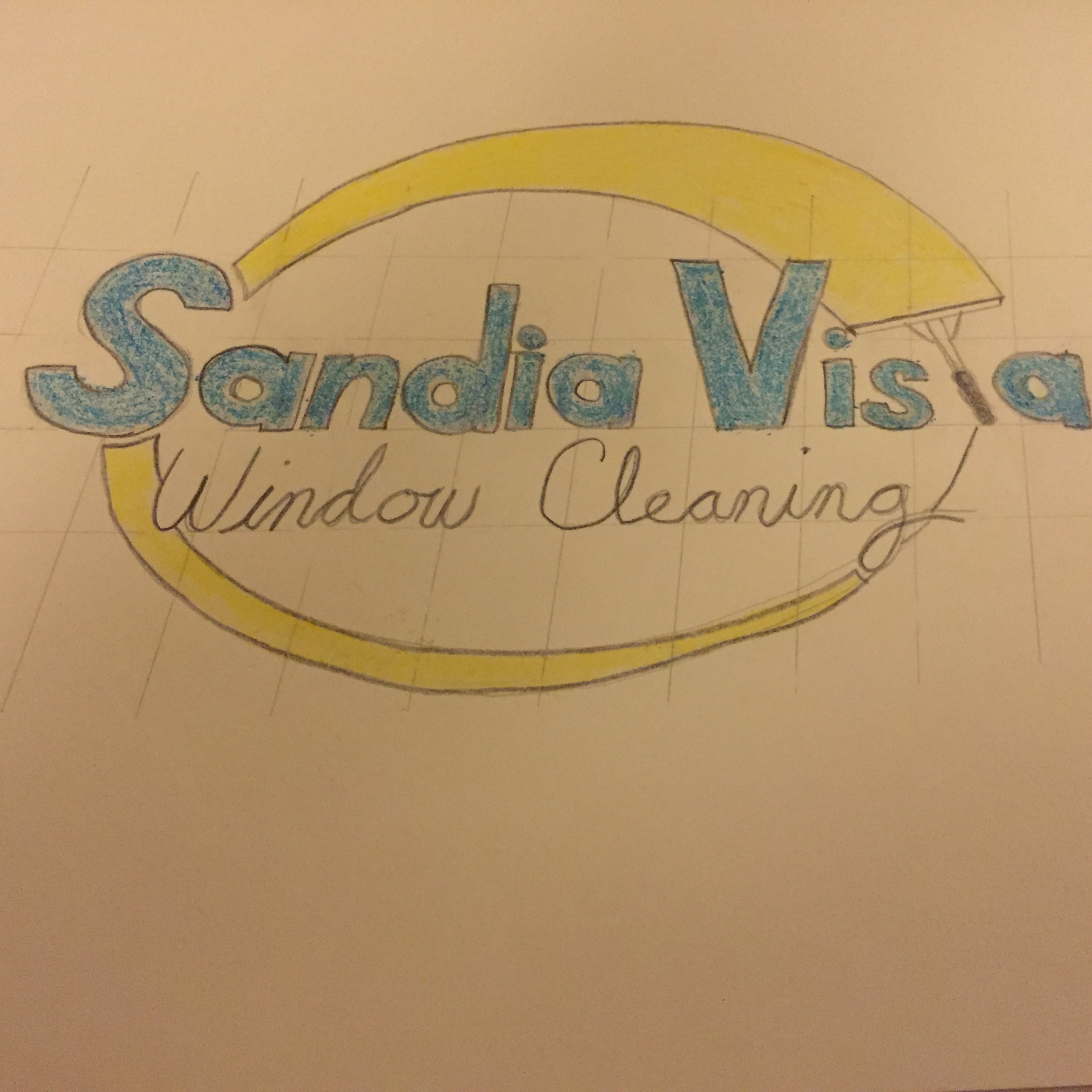
Color brings out some discrepancies. I have a slight forward slant on the letters. I think the opposite slant on the squeegee is too off putting. It would probably look better with vertical letters.
1 Like
Very nice. I would stilnwith silver instead of yellow. It takes away a little bit from everything else
The Sandia Mountains have a beautiful outline. I really enjoyed the scenery back in the day. What if you had that outline on the back of your logo?
1 Like
Hey Tommy got your text but I’ve been out till just now.
It’s not bad. But what really matters is if your wife likes it. Does she go “oh, that’s nice” or does she go “eh”.
She’s your target demographic so what does she think?
1 Like
That was the original plan, hence the name Sandia Vista, because everyone in Albuquerque has a view of the Sandia Mountains. The problem is everyone has the mountains on their website so using the Mountains kind of seem like I’m blending in with the crowd.
1 Like
She actually loves it! Win Win! I texted her the same picture and she was stoked.
1 Like
I dig the logo
1 Like
Nice! Your tag line can be “squeegee inside”!
1 Like
Now the question is how do I turn it into an actual logo? Do I send it to someone on Fiverr and have them do it and tweak it as necessary? I’d like to get it done ASAP so I can get my shirts and marketing material ordered.
2 Likes
You could try fiverr and I know I’ve person who could probably do it. Don’t know what she’d charge but she’s good.
Get Gimp. It’s free. It will let you scan that in, trace it, color fill and suddenly it looks sharp.
1 Like
