
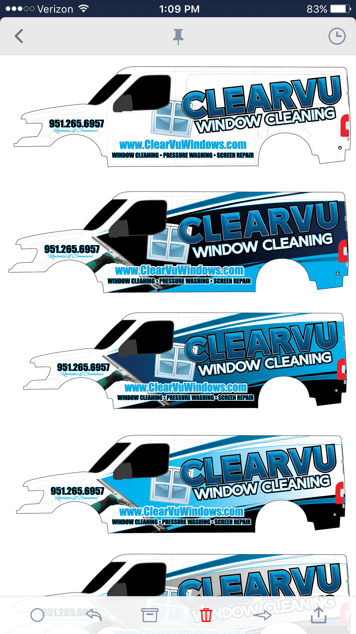
The one with the green in it
I like this and I think you should do it similar on the sides. Bigger phone number on the sides an maybe do away with the squeegee. I know your tryin to create a swish with the squeegee , but my opinion is do away with it. JMO
Are you paying for a full wrap ? When I did my wrap I told them I don’t want to see any white I want color through out. This just me though that’s what I liked an wanted. Everyone is different.
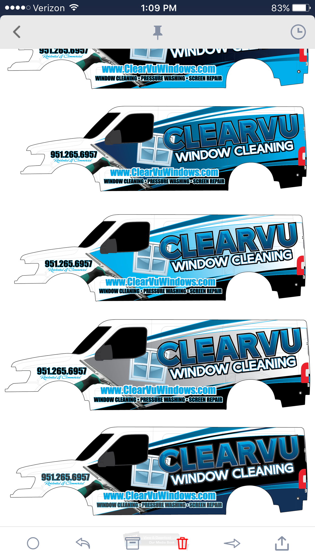
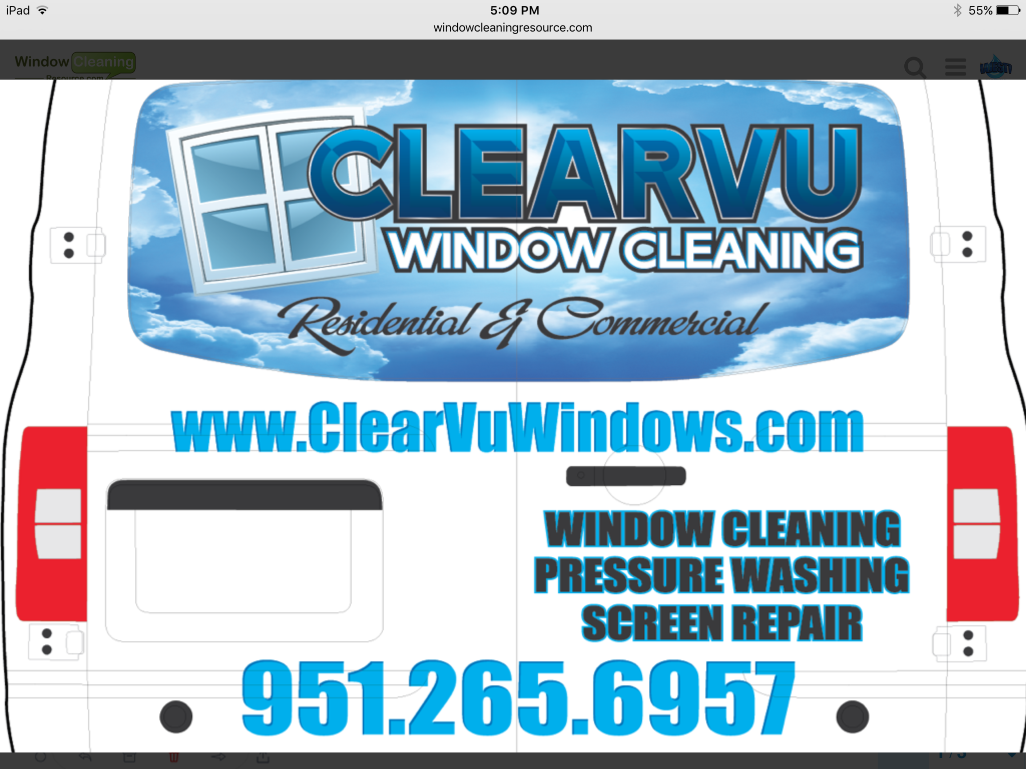
I think with this pic make the white in the back a grayish or something color., but I really like this back.
Nick what are they charging you I paid 3000 for mine

Mike,
I know what you’re saying… It’s a buddy who owns the biggest local shop here, I just told him to make a wrap whatever. Don’t want a full wrap, and I think im paying about 1400.
I’m undecided on what I want honestly, I can be picky for days and sometimes just end up going for the simplest one. Kind of debating just sticking with the basics and edit the white one with basic info
Oh ok cool. Because it seems like it’s suppose to be a full wrap. Good price fir what you got going on.
Take your time make sure your 100 % before you pull the trigger. I know it’s stressful . It’s hard to figure out what ya want.
I like the clean white siding - top left (cant see what rear looks like thou) although i like the looks of the rear thats is shown.
But then i like clean lines
I like the simple white one personally but I’m a minimalist.
\Hey Nick I think they all look good. I would go with the basics. Customers only have a brief moment to get your info while traveling down the road, dont distract them with all the “WOW Colors and tools.”
hope this helps!
I agree with Eric. The clean white one is the best. Less is more on vehicle vinyl imho. That one would be a killer mobile ad… It’s one of the best wrap designs I’ve seen. Your guy knows what he’s doing, not just on the aesthetics but the function too, which is more important than looks. He’s hot a nice mix of the two going in there.
the plain white is by far the best .
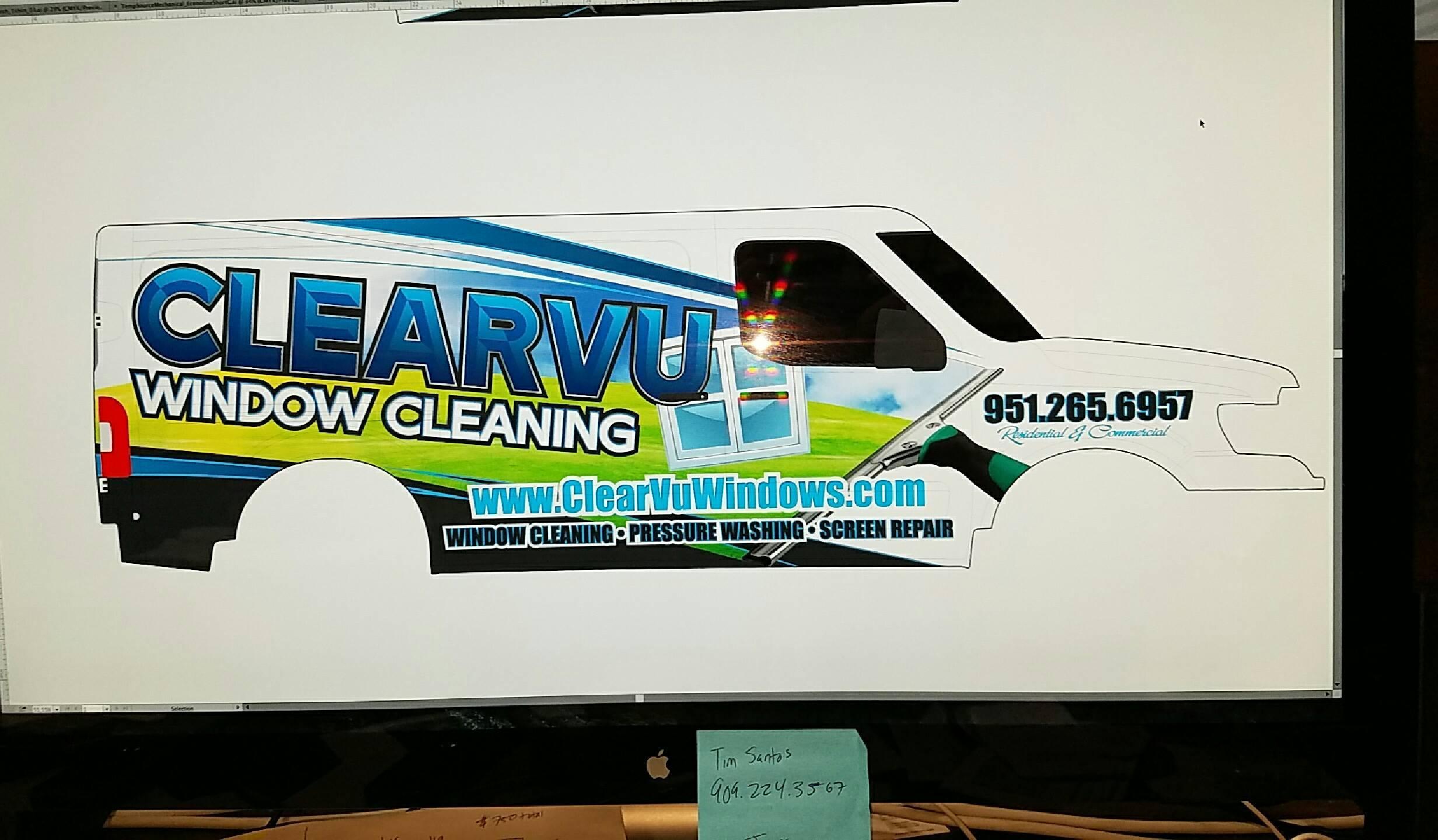
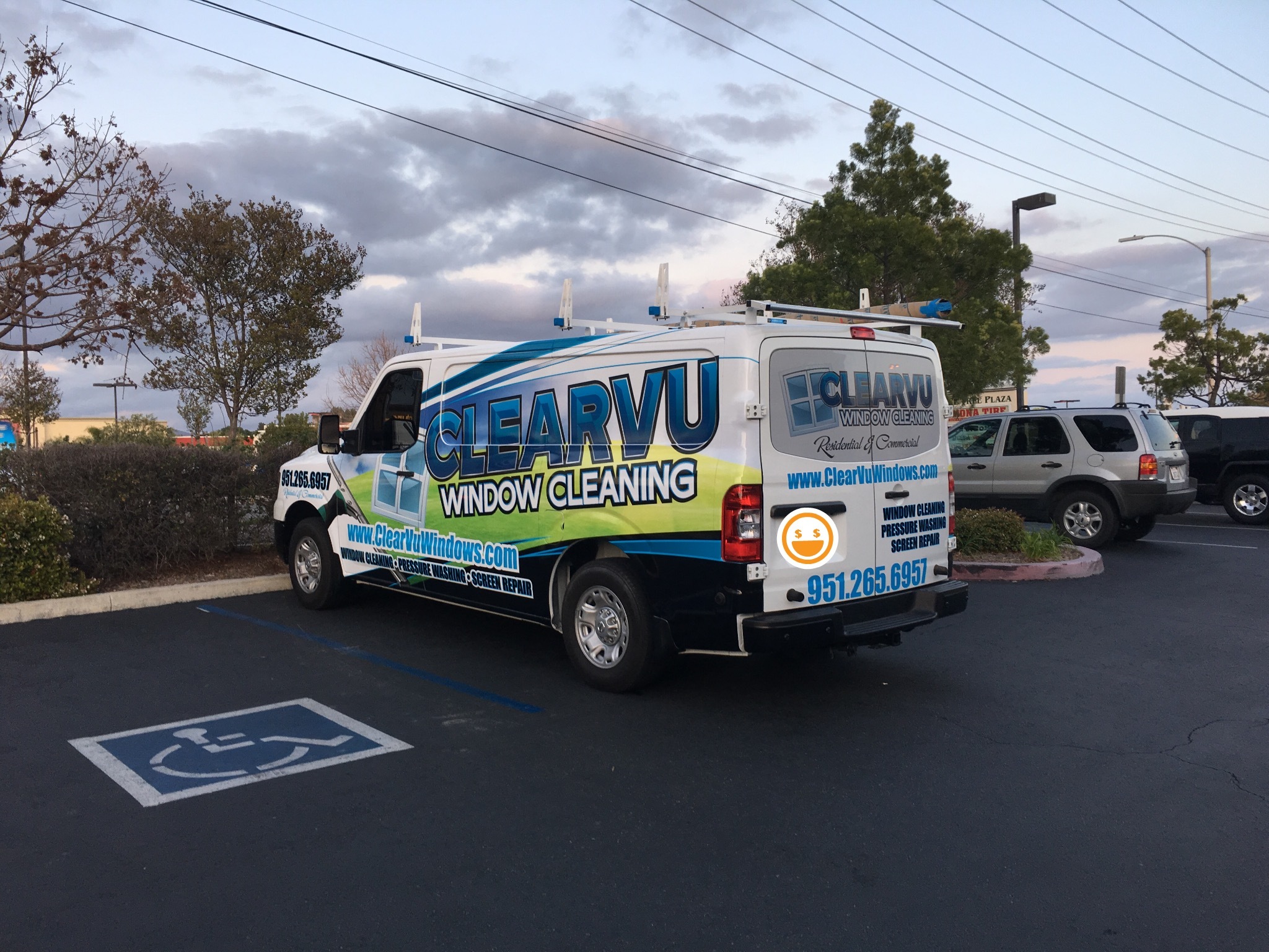
I was leaning towards keeping it simple, but I kept going back to this one and pulled the trigger on it. Picture really doesn’t do it justice, it looks awesome and is a perfect mix of what I was looking for. It’s huge, and really stands out
Thanks for everyone chiming in!
Looks good Nick!
Happy you got what you really wanted.
Now get that giant billboard out on the road! 
Man that is so bad ass! Neighbors are going to be jealous when they see that in their neighbors driveway and then their window cleaner shows up in a rusty old corolla with a roof rack! They will be writing down your info for sure, this is going to get the Ms. Jones effect going!
I feel like in this day and age the name is the most important. No one actually writes down a phone number anymore! A quick google of the company name is the go-to these days. And what a sweet name it is too.
How long have you been in operation? How many vehicles have you gone through? Do you use WFP or mostly squeegee?
That’s a nice looking truck! Hope to have one like that myself by next year.
very nice
WOW - that looks tight… The mock-ups didn’t do it justice. I bet it pays for itself quick.
