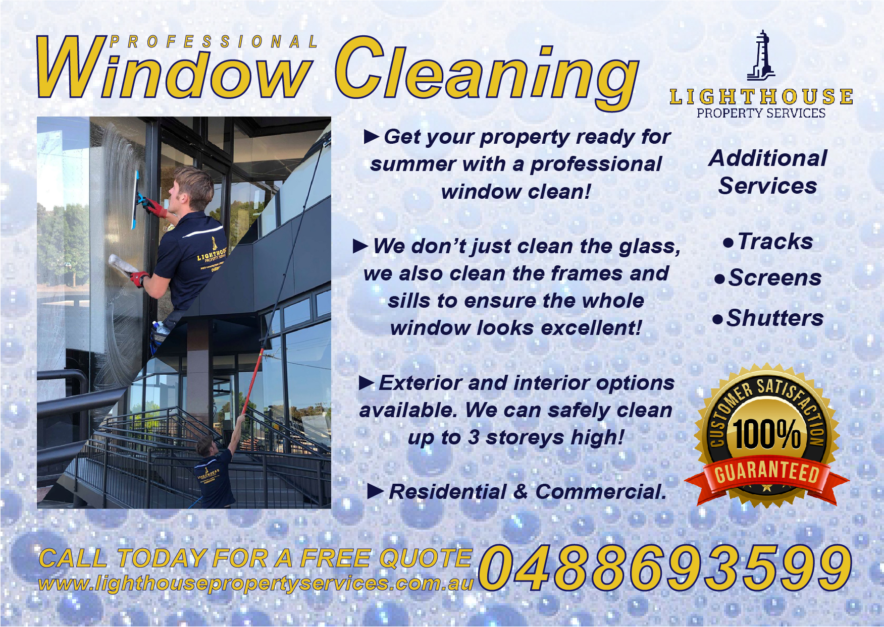
Double sided A6 postcard, 350gsm. One side window cleaning, the other side pressure washing with before/after pics. Ordered 1000
Already got them printed, would like any tips for the next lot I get.
Double sided A6 postcard, 350gsm. One side window cleaning, the other side pressure washing with before/after pics. Ordered 1000
Already got them printed, would like any tips for the next lot I get.
Looks great, I would be less descriptive about the services… straight to the point has always worked best for my marketing pieces.
Some examples if my wording:
Residential window cleaning:
Screen cleaning
Track brushing
Sills wiped down
Fully insured, free estimates
Visit us online at _______
Give us a call today at _______
The less a prospect has to read, the easier you can keep their attention.
Or I could be completely wrong and this way of wording works great in your market, 1000 pieces will most definitely let you know if you’ve got a good marketing piece
I find the text at the bottom saying “Call Today” and your phone number hard to read. Might help to have a solid colour for the background behind that text.
The header yellow text doesnt pop out too much either IMO, maybe play around with adding a stroke or drop shadow onto the words. Assuming you are designing this yourself.
Remember, you only have a second or two to grab someones attention before they throw the flyer in the bin so you want to make the most important piece of info on the flyer POP out
Thanks for the reply. I will keep that in mind for the next drop. I do agree, the less you have to read the better.
Hi Josh, yes I thought the same thing, in person its easier to read however. Old folks might have a bit more trouble. I made it yellow with the navy blue stroke as it’s my business colours. This is my second drop of flyers. This is what the first one looked like… I designed this one quickly and didn’t put too much thought into it. I think the current one is an upgrade. I appreciate your critiques
Less is more, I looked away in half a second and thought ughhh, I’m not reading all of that.
A shirt, postcard, vehicle needs to contain Business name, logo, services and contact info. People that add free estimates, residential & commercial, or descriptions like your sentences hear overload the prospect. Your customer should immediately know what the postcard is I looked at it and was like oh wow I have sentences to read here. The more a customer has to see the faster they look away
Thanks for your feedback. I’ll see how much work I get from these and then i’ll implement the simpler approach if need be
I always tell my clients to try to stay away from Italic fonts. They are visually unpleasing for most people and are more difficult to read. They should only be used sparingly and for specific reasons.
In the case of your first postcard, almost everything was italicized and bold.
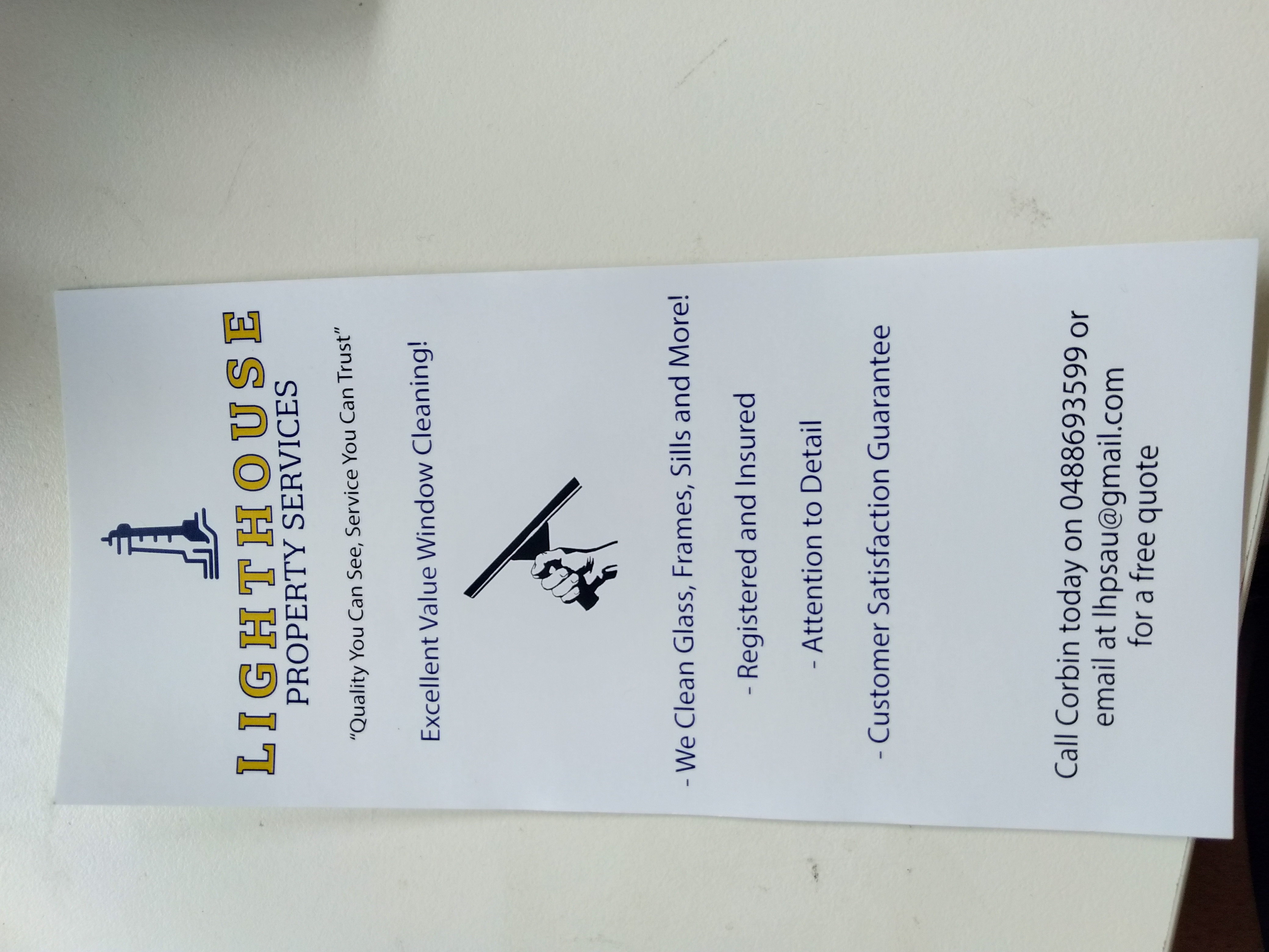
looks good ! Only problem is you put your routing number to the bank account
Your phone number should go there !
What’s your bank account number