Just got a new logo made. Please tell me what you think before I make it final
Jesse
Atlas Window Cleaning
North Carolina
Just got a new logo made. Please tell me what you think before I make it final
Jesse
Atlas Window Cleaning
North Carolina
Humm, what is it?
Sent from my XT1254 using Window Cleaning Resource mobile app
Way too busy imo
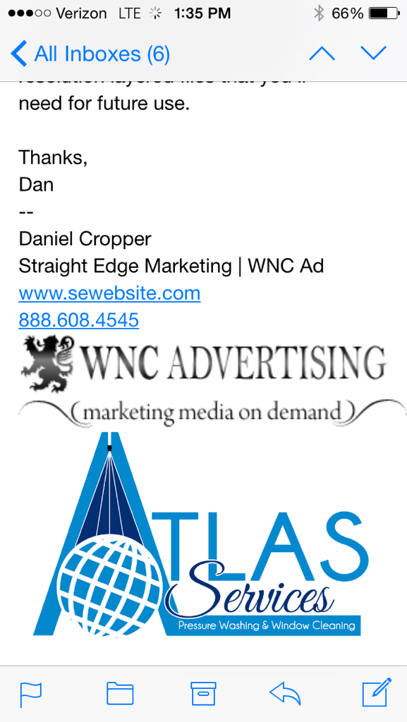
Sorry, that’s a screen shot. The “WNC Advertising” is part of the designer’s signature.
My company is Atlas Services - Exterior Cleaning Specialists
I’m wanting to lean more toward pressure washing for the bulk of my work, so the apex of the “A” is meant to look like a spray nozzle.
Jesse
Atlas Window Cleaning
North Carolina
Yeah…I kind of think the globe is too much. What are your thoughts?
Jesse
Atlas Window Cleaning
North Carolina
I don’t think the globe is too much.
It fits the name, and I like the fact that the sprayer is cleaning it. ![]()
It’s the “services” part that I’m not thrilled about.
Looks out of place.
(although I guess it looks a little bare without it)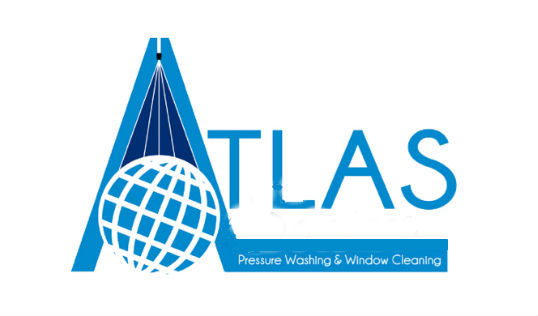
Reads just like “Atlas” the services you do seem redundant as you cant read them easily, so will be difficult if on a van/truck.
I understand the design of a sprayer over the globe, but I dont see how it is easily recognisable
More a “identification” piece, than a marketing piece perhaps?
Thanks for your thoughts J, and the edit! What if “Services” was in the blue stripe at the bottom? (Sorry, I’m can’t edit like you did, I hope what I said makes sense!)
Jesse
Atlas Window Cleaning
North Carolina
Design is relative to the eye of the beholder but here are MY thoughts…
The overall design is too busy. A logo should not include the extras like “window cleaning” or “pressure washing”. The logo should be a stand alone design/brand.
Drop the extra wording and drop the large A with he pressure washing nozzle. Keep it simple with the Altas/Sphere/Globe and your company name.
Simple Simple Simple
I agree with you. I just got off the phone with the designer and explained that the services I offer will be listed in other locations (on the vehicle, card, etc). He’s doing some edits and I’ll post those as soon as I get them
Thanks guys!! Ya’ll rock!
Jesse
Atlas Window Cleaning
North Carolina
Yeah, but as Chris said it’s unneccessary.
And the Window/Pwashing is alread there, and more importantly needs to be.
Atlas Window Cleaning. Boom
Atlas Pressurewashing. Straight up.
I’d actually emphasize it MORE. Color theory is your friend.
(ignore the yellow sprayers, the words was my point)

Oops, never mind, I guess I disagree with Chris.
BTW, I’m sorry, I don’t want to be all pushy “putting my feet up on your table.”
I want your feet on my table! I need all the input I can get…and I like the yellow around the spray…I’m gonna suggest that to the designer.
Jesse
Atlas Window Cleaning
North Carolina
Here are the two edited ones…What do you think?
( I think the globe fits now)
Jesse
Atlas Window Cleaning
North Carolina
One last request for input. I’m about to pull the trigger on the one with the globe. Any more suggestions?
Jesse
Atlas Window Cleaning
North Carolina
Globe, definitely. 
Cool. Thanks, again, for the help!
Jesse
Atlas Window Cleaning
North Carolina
You neither agreed or disagreed… I just had an observation… ![]()
But there is no real point in having what you do in a logo (i just thought that was the route [MENTION=37432]Atlas1[/MENTION] was taking?) - a logo is just a branding thing… to be identified.
like the nike, apple or visa logos.
Just checked the new designs i prefer the globe one also. (not that hot on the logo design, but then again, it’s not my logo - lol)
^^Exactly what I wanted to say.
Have you experimented with different color combinations? I think that would make a difference in the appearance, I’m not to hot on the color combination but that is a personal preference.

