A Friend of mine designed this for me. i gave him the basics of a peach and a squeegee and he took it from there. I am a knuckle draggier by trade so when someone has way more talent them me, I usually step aside and watch them work.
I like it. Clean and neat. Very cool
Thanks Phil!
This is great, really eye catching and once you see it, it sticks in your head. Can’t wait to see you post some pic’s of this on a shiny new work vehicle someday ![]()
i like the concept, but i think for a logo there’s too much detail. i would try to have it simplified- just three colors, no gradient on the peach or facets on the leaves, less detail on the squeegee. try to make it more iconic. if you look at all the big successful companies, very few have really detailed logos. if you try to print this on a t-shirt it’s going to take like 15 screens.
otherwise, it’s a nice idea. my .02 cents anyway… what do I know.
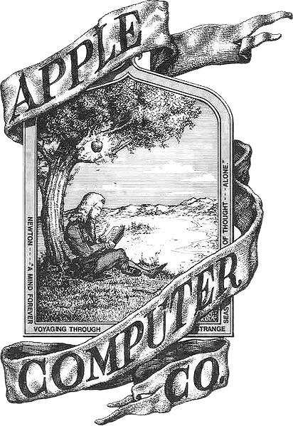
If he likes the logo - I say stick with it. Many successful companies and sports teams use or have used highly detailed logo’s. People LOVE my logo and I am highly recognizable, people remember the window cleaner with the monkey on his back - I get compliments and great feedback on it all the time. The importance of a logo is to make your company distinct and recognizable, it’s your personal mark of the company. Just remember Apple computer started out with a very highly detailed logo & so did “peachyclean” ![]()
Apples First Logo lol
100% Ditto/Agree on the screen printing, I do mine DTG for now because it’s so darn expensive - doesn’t look as pretty but it works!
i get where you’re coming from, but i respectfully disagree. unless your end game is to be totally local and have your customer base identify your logo with you personally, then the detailed image works against you.
coca-cola doesn’t use a logo of a bubbly glass of ice cold soda next to a bowl of potato chips for a reason. they want to be iconic. the idea of a logo for them is that people see it and associate it with their brand instantly.
you want people to look at your logo and think “window cleaner… oh, i need that.”; not “hey, I like that logo, that’s clever. oh yeah, that’s so-and-so with the cute logo.”
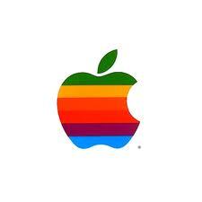
an iconic logo serves that purpose more effectively. for the record, if you asked anyone at apple if they would ever go back to a logo like the one you posted they would laugh you out of the board room. they didn’t become relevant till long after they switched to this:
not doggin’ your logo, bro. i really like it! it’s just that if you plan on expanding and transitioning from “the guy with the monkey on his back” to “that awesome window cleaning company that i see everywhere” you might need to consider the reasons taco bell, microsoft, ford, pepsi, mcdonalds, dewalt, nike, gatorade and everybody else shoots for “iconic”.
I do think the logo is cool, but probably too complex to be easily reproducible on shirts, biz cards, forms, trucks, website, etc etc etc. Simpler is better, IMO.
I think you should have two versions, the very nice one for big investments (trucks, glossy ads), one simple for shirts, everyday paper items.
This space for rent!
I don’t like it. Of course, Mole likes it, everything Georgia is peachy. ![]()
John K Wyatt
All Washed Up Window Cleaning
awuwindowcleaning.com
I find myself in the awkward position of agreeing with michael for the second time.
You can see my logo,
here.
This is the watermark that I use behind my lettering,
here.
Here is a picture of the Statue of Liberty decal from WCR that I put on the back of my truck cap,
.
I wanted to add some color to my white truck.
I do like your logo @Peachy, it’s very creative and attractive.
10 million posts and you’ve agreed only twice? Dang, I need to up my game!
To be fair, I did half agree one other time.![]()
My Question is why is everyone so stuck on a logo. Do we sell “LOGO’s” or do we offer a service?
I believe we should be less worried about the LOGO’S and more focused on the actual concept we offer as a service.
I get where your coming from and I can definitely agree with you. I don’t take it as “doggin my logo” and thanks for the compliment! Yours is pretty cool too - I’m always up for some good conversation and different viewpoints, helps keep me out of a hard headed rut!
I guess what I am trying to say is that I believe there is a place for Iconic vs Detail oriented logos, and that small or growing companies may be better off with a detail oriented eye catcher vs iconic logo for the first few years. The way I did my logo was carefully thought and planned - I personally love and looked into classic word styled logo’s.
The reason I went with “detail” was because I have to deal with things such as the local fishy franchise which I hear about from possible customers all the time. If I am correct this fish franchise was one of the top for growth in the nation sometime over the past few years. If me you and fish all pulled up in our vehicles with logo’s - which one is the logo that will actually get noticed and receive more attention? In other words which logo will be actually “seen” and at the end of the day someone could go back and pull it out of a pile of 100 window cleaners logos who have the typical squeegee and glass? When I had my logo designed I wanted a design that was noticeable and “stuck” in peoples heads - so far it’s had great success. From what I see - large successful company’s usually go “Iconic” as a process over many years and revisions, once people know the company and the product they can tone it down a bit. Anyway that’s my theory so far, and I think it’s a good marketing approach while I am still a smaller company. I gotta be flashy to survive ![]()
I think I get stuck on logo’s because I view mine as my “cover letter”. If a future “employer” knows nothing about me, the most intriguing cover letters usually make it to the top of the stack - I want them to wonder about me enough that I get an interview.
There are many successful companies with lame or generic logos but for me I don’t want a lame logo.
I love my business and I want a logo that represents me and my guy’s. When I see my logo and the money I spend to keep it fresh i am doing it for me and to represent our company.
I love the logo Roger and maybe you will come across my sister in Keller. Great community
that’s a good post and you make a lot of sense. i think there’s a big difference between your logo and the OP’s. your’s is a conversation piece. it’s a little off the wall, not too much, but enough to get people talking. the peach and squeegee doesn’t have that going on. it’s a little generic. it looks nice and gets the point accross (window cleaning in georgia) but it will end there for most people.
i think yours is going to work for you (at least for the time being) by drawing attention, whereas the OP’s will be seen and most likely forgotten until it’s seen again. that’s why i would suggest that one get simplified.
the point is, a logo is the main visual cue that connects people’s thinking to your brand. when people look at it you want them to instantly think
“window cleaning” or whatever, not “what is that picture…?” a simpler image does that more effectively.
if you and i and fish all went after the same job the logos would be the least relevant factor as to who gets it. thats more about the seller’s ability to connect with the potential client, show them the value of the service offered and get to the core of what they want. [MENTION=6741]wcs[/MENTION] is right that your logo doesn’t matter if you suck at what you do.
That is my Point @cwininger [COLOR=“#0000CD”]“[MENTION=6741]wcs[/MENTION] is right that your logo doesn’t matter if you suck at what you do.”[/COLOR], I just wanted to state that a lot of new people worry about LOGO,and putting out 10 million fliers, ect…and they cant operate a squeegee correctly or know what tools they truly need to function as a window cleaner,PW,ect.
I would change it if you have any doubt but if you love it that is all that matters. I’ve changed my logo once and will probably change it again just by adding color or making the font more legible. I will never be like coca cola so no one will care if I change my logo. But if I improve my logo will it draw more good attention? Yes.
