So I got some logos done for me , they did 2 good options . One is more of a vintage Desing and the other is more of a traditional Desing . Let me know which one you like better , please feel free to ask your spouse what they think if you get a chance . Thank you
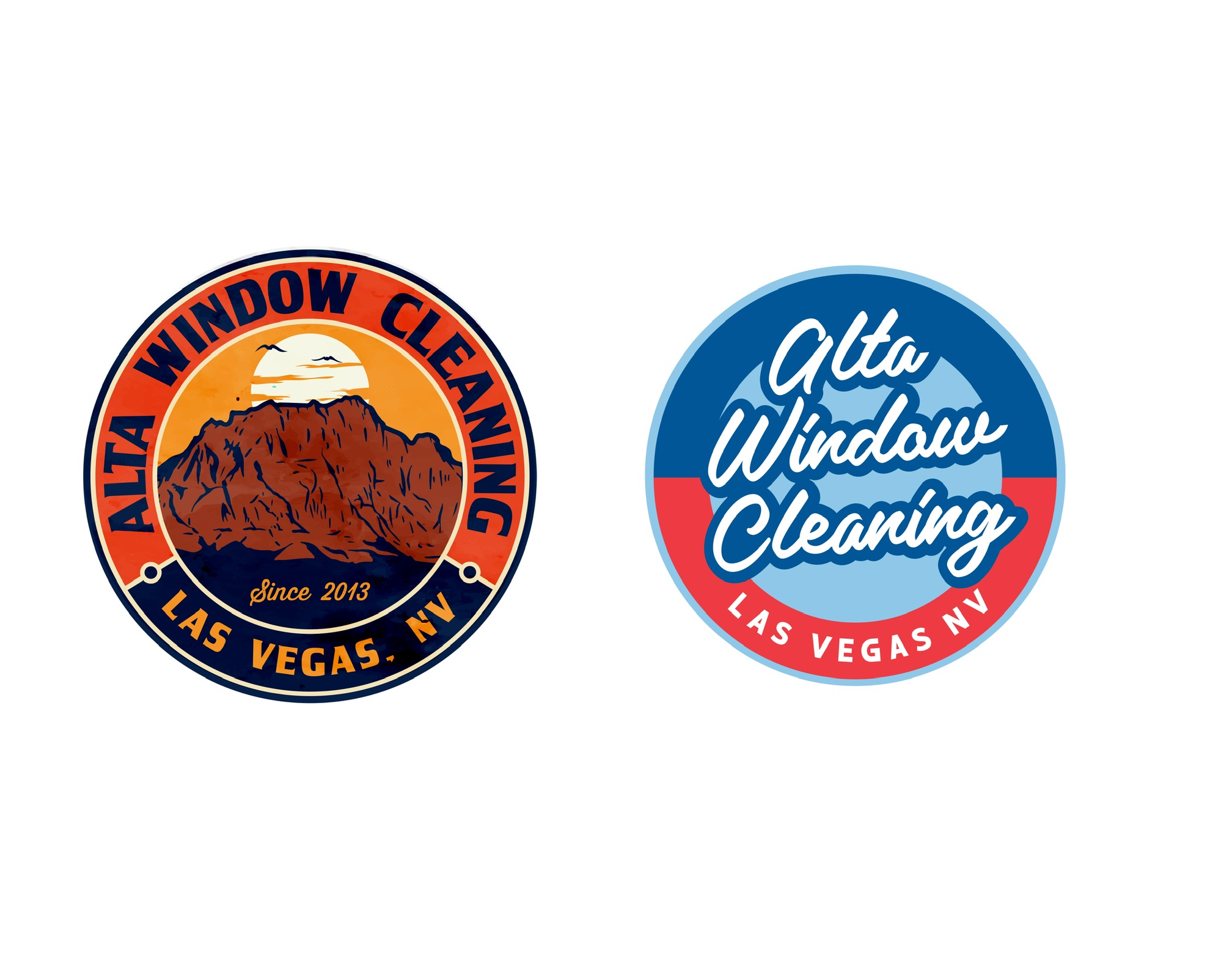
I prefer the right one. It is simple, better for putting on shirts or small things like your business card. Easier to read, primary colors.
1 Like
Both are hard to read quickly . The one on the left is better but the lettering needs to start about the 10 o’clock position instead of 8:30. People don’t like to read vertical words.
The font on the right is difficult to read. Looks like it says ‘Atta’.
1 Like
I like both. I have a similar style, the circular type of logo.
I think it depends more on what brand you want to portray, like the black red yellow type of theme on the left or the blue red white theme on the right.
1 Like
Left
1 Like
The one on the left with the colors on the one on the right
1 Like
Left…I like vintage. My website is totally my rendition of vintage. Script is hard to read.
1 Like
The right one: The script is hard to read; use a different font, then it may pop better? Simple goes a long way.
The left one: The colors are cool and grabs your attention, but how will it be used? On shirts, hats it will be difficult if embroidered. Size will matter as smaller is hard to read, so need to think about that.
For stationary: Both may reproduce well, still the script font on the right is a tough one.
1 Like
I like the one on the left .
looks like a casino gambling chip.
1 Like
Left
1 Like
