what do you think?
1 Like
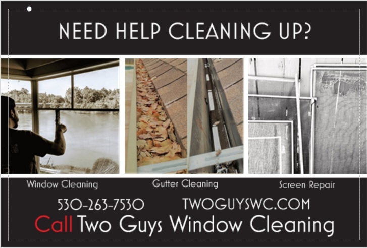
overall i like it but i find the pictures don’t convey the message quickly, i had to “take a closer look” that combined with the captions being a bit small i didn’t get the message of what the services were fast enough
my suggestion would be smaller but more effective pictures to allow room for larger captions.
I would recommend joining the wcra and using the postcards. Or use send Jim. Preferably both. Disclaimer: I have never send a post card.
However when I begin to scale I will do what I just recommend.
In other words us a tried and tested design. Other wise you may as well light a few hundred buck on fire.
1 Like
You are off to a good start. I would consider:
- A change of color
- Focus on just one service, its ok to feature three but give one the main attention not equal
- I would trim down the bottom lines font size and switch its location with the line above
- Put the phone # and the URL on the bottom
I noticed you just joined TheWCRA - Consider using one of our premade templates - https://shopwindowcleaner.com/business.html
They add a touch of professionalism as they are professionally designed.
It does seem that you do like to make your own cards though I recall you posting one in the past. Consider using one of our templates as a base. Deconstruct it a little bit and build your own design off one of the existing color pallets.
Overall i really like it. I agree with @Tgrove28 that the colors, particularly the pictures i feel, need to be brighter. They don’t convey clean with the drab colors.
Also, @chris makes a good point about putting the contact info on bottom.
I would add that the screen repair isn’t consistent with your “Need help cleaning?” headline.
i don’t have photoshop to edit those files
Look an Amazon for Photoshop elements. It can be found sometimes for around $50
A cheaper alternative that can edit most of the cards.
1 Like
Could GIMP work? It’s got a lot of the same features as Photoshop and it’s free.
+1 on the colour change.
A nice eye catching blue maybe - but black is easy to overlook & won’t stand out in a bunch of mail.
You could pass it off to a graphics student looking to get practical practice under his/her belt. Helps you and helps them.
Or as Chris mentioned, use their templates.
1 Like
templates still need to be customized and adjusted
I agree with the recommendations to change colors and pictures. With good pictures you don’t need words describing them. I would remove “need help cleaning up?” because you will get calls for all kinds of clean up crap you have no interest in doing. Then put Two Guys Window Cleaning at the top, leaving room then at the bottom for a very large Call 5032637530 and a smaller url.
I liked Chris’s comment too about offering only one thing or at least not making them all equal this could leave room for some sort of offer.
1 Like
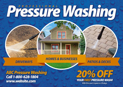
You could utilize a design similar to this, with your own wording and pictures of course.
as usual diverse opinions:
common thoughts though seem to be:
the message isn’t clear enough quick enough.
pics could be better.
the bottom is a bit crowded.
re the colour suggestions. after 22 years in the photo business designing digital mats for high wedding photographers and direct to end customers working with both full colour, black and white, spot colour etc i can tell you NOTHING sets off good colour photos better than a black background.
good luck
edit:
it’s also not as common for advertising so it may help you stand out, @Louie_the_Window_Guy said he was getting awesome results with a b&w flyer.
1 Like
i appreciate all the feedback from evryone, i’m considering it all, i haven’t had any time to work on the flyer, but when i do i’ll post an update.
I do like the look of photos on black, and i don’t see any advertisements that use it, to me all the red blue and yellow pieces blend together, nothing about them stands out
3 Likes
Because those colors sell
Research the effect of color on sells
