I think it looks cool! However….
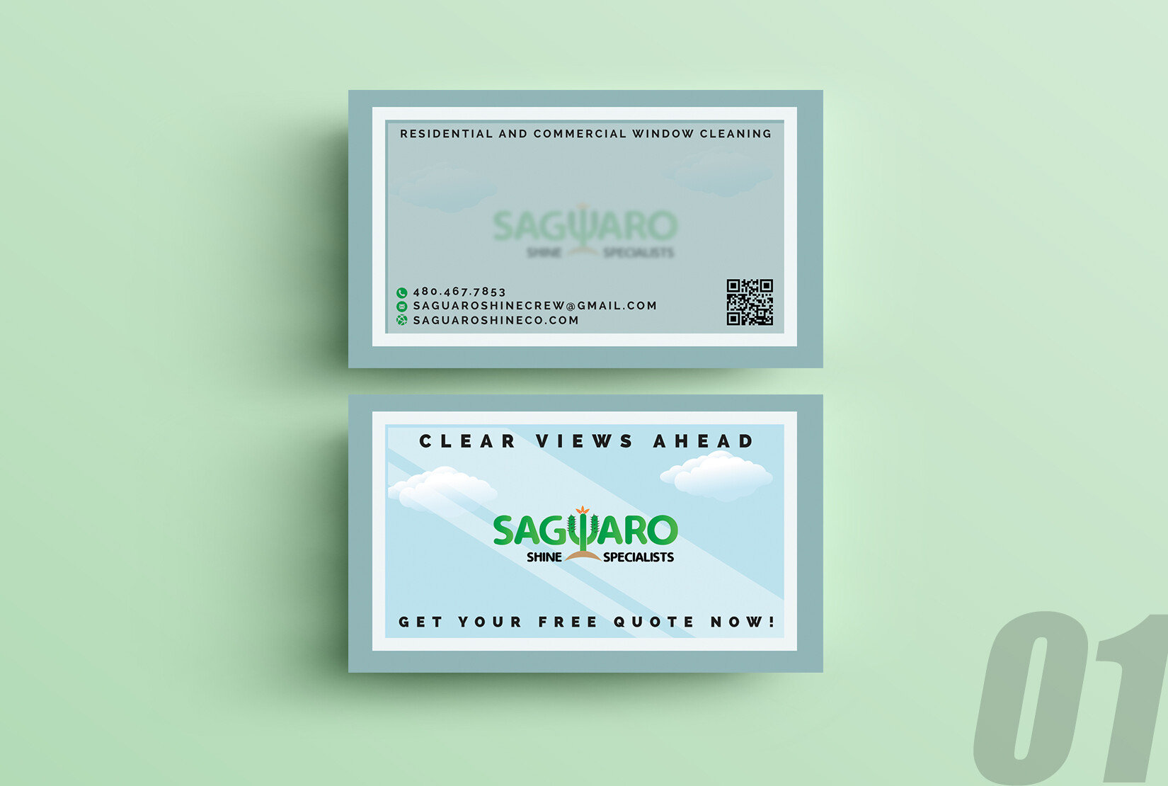
I thought the cactus was a W.
If you are ShineCo or Shine Crew, it might be nicer for the email and domain to match, but not a deal breaker.
What’s the average age of your target customer?
If they are older, the fonts are a little small for them, though I like a card with lots of breathing room.
If they are older, the QR code might be needless.
I like it, but those above things come to mind. Hope this is helpful.
@MJ79 those are some great points! @SaguaroShine I would make the logo, text, and QR bigger.
You want your logo to be front and center and text always appears larger on screen than when it is printed. You definitely want to make sure any age group can read it. The QR may have issues scanning at that size, you might want to make it larger to be safe. The recommended size is .8"x.8".
I would be careful with the borders, too. Make sure they are all the same size all the way around. There is a slight shift allowed during printing (this applies to us here at the wcr print department as well as all printers) so you want to be careful the border does not turn out uneven when they are cut.
Here are some of the templates we offer, you can use this as a basis for font size and layout if need be.
Let me know if you have any questions =)
Is it at least clear plastic or is it just regular stock?
I agree with comments made so far. Definitely make all contact info larger and put a phone # above “get your free quote now”
Make
Window Cleaning bigger
And residential & Commercial below it smaller
