What can I do to make my logo more shirt friendly so to speak, As of now it has to many colors, and screen printing is to much . Should I have some one Re-do my Logo same concept different colors just for the shirts . SMH don’t know what to do .
1 Like
yeah, too much gradient. can’t your artist just give you a simplified version? you could look into dye sublimation, then they can print the exact image no matter how complicated, but i think it’s kind of pricey too.
Sport grey or heather grey. Ya I might lean towards the redesign I’ll look into the dye submission see what they can do with that also
There’s no need for your logo on your shirt. Your name and what you do over your left tittie. I.E. Joe’s window & pressure cleaning. Then bigger in the back with your phone number. Your logo is on your card your truck your flyer your door hanger etc… Save a buck or two. All they need is your name and number off the shirt. Jmo
3 Likes
Good point Jack, I think having a logo on the shirt does help with keeping the same look. I had our designers make a logo without gradient for our new logo. It still has like 4 or 5 colors and is pricey to screen print but can be done and looks close enough to tie our brand together.
I would just lose that background water drop and have the lettering screen printed or embroidered.
Food for thought- maybe you can simplify the logo to almost be badge like for the left (chest) area of the shirt. I’m thinking just a simple yet crafty (M) in the center of the nice water droplet. This could just be for your shirts, hats, stationary, etc…
You will still have your full logo for the vehicle wrap, web site but utilize the badge as a stamp (not literally).
Then you are still creating a (branding) and can keep it simple enough for screen printed shirts. Fiver.com and I am sure you can find a nice college student to make you one for $20.
Evan is onto something here. Keep the style of the logo without the “frills” on your work shirts. After all they are work shirts. They get dirty and all used up sooner or later. Full logo could be reserved for jackets, hats, sweat shirts…etc…ya know…dinner wear!
1 Like
You could check out DTG (direct to garment) printing. They can do full color without the expense of screening. You’re usually limited to light colored shirts, though.
2 Likes
An artist should be able to produce a simplified version of your logo with no gradient. I would definitely use a logo on your shirt to maintain continuity.
2 Likes
For polos I have full color screen print front left chest but shirts I have all white logo and lettering on back on navy blue shirt. Stands out and you can wear navy blue w khaki brown, blue or black shorts/ pants.
The all white can look pretty slick and consistent with other logos which are on vehicles and cards.
Lot a good feed back here guys thanks .
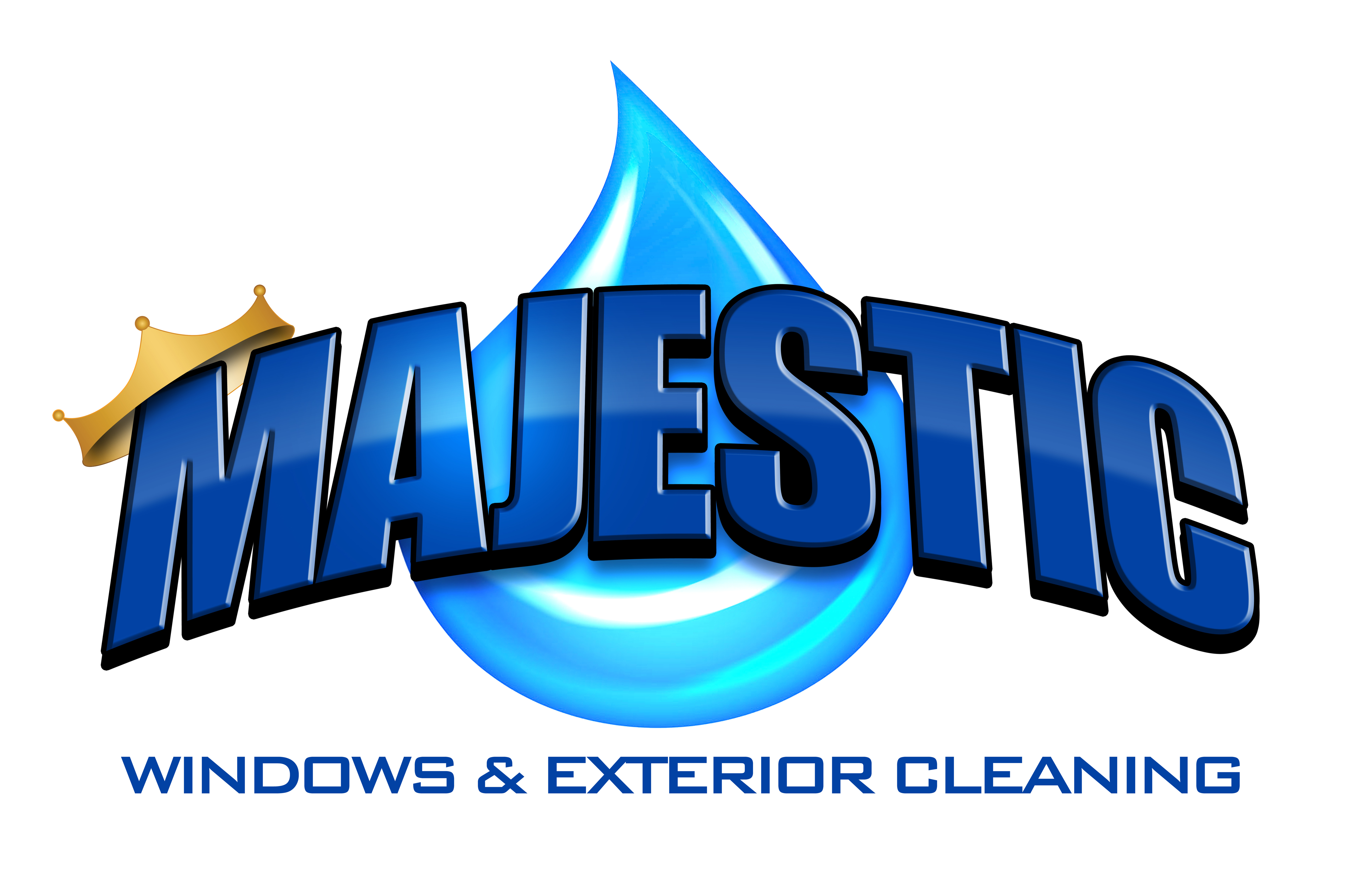
I thought it was all the colors in the logo that makes this a screen printing nightmare . I was told the more colors ( after i did the logo ![]() ) which i think there are 4 in my logo the more screens the shirt needs .
) which i think there are 4 in my logo the more screens the shirt needs .
So the Gradient in the water drop makes this a difficilt procsess for scsreen printing ?
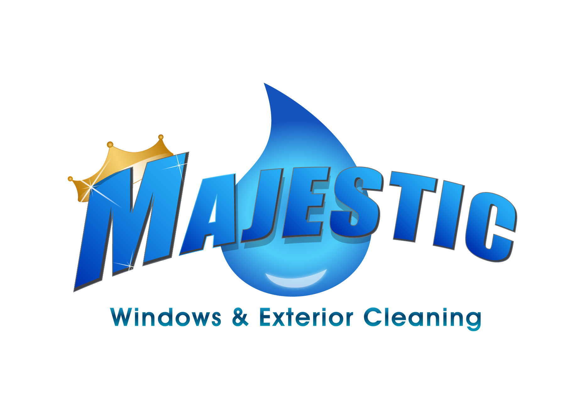
Here is my logo that was designed by logo Bench same concept less gradient . the logo above was re-designed by my guy who did my wrap, and i liked that one better so thats what we wwent wiith on my Van & i put it on my website, I did my cards before the van so…
I would still get soneone to Redesign it if thats the direction i decide to go i just trying to figure out what the redesign should intail to make it descent looking, an stay in the same concept.
1 Like
Mike I like the first design way better.
But I understand where your coming from (cost) on the screen printing because of the color gradient.
If it was me making the decision I would personal pay out the cost to keep the first design because i would want everything to flow, marketing wise. (and the logo rocks!) 
A few other in the thread gave you some other options I would look into also for printing the same design…
Lets us know what you decide!
1 Like
Gradients can be a tough do onto shirts. If you are thinking of an alternative but similar logo to go with the words of your logo here is a rough idea.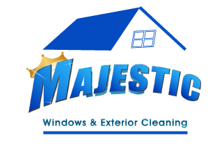
interesting how the drop almost becomes a happy little smiley face.
Just leave out the gradient…Use solid colors…I don’t think anyone but you will notice.
4 Likes
Yes I think that’s the way to go. I’m sure if I could cut down the gradient keep it to less colors. Try to keep it near the same if possible like Steve am some have said The screen printing would be fair priced a shirt I think
I’ll look into other processes also.
I like he M an water drop idea . And ya I could get away with no logo an just name
Gary thanks for the design I couldn’t go with a house got to have the water drop.
2 Likes
don’t pay for logo re design your logo is good. any comprehensive shirt printer will be able to figure how to make it more practical for the process being used, silk screen, embroidery, dye sub
