Go to http://masterproclean.com. Look around. Tear it apart (but don’t hack it please).
Seems like I’m in the same boat with a lot of other guys here in taking a slow winter to work on the website. I want you guys to show it to your wives and tear it apart. Ask them what they feel when they look at it.
I’ve already shared it with my Facebook friends asking for the same. There’s still a few suggestions I have yet to implement. I’ve also got some hidden landing pages (no menu link) that are used in my RB follow up sequence.
There’s also some elements I’d still like to improve but need to learn more html/css
You used the words “tear apart” so Im going to give you an idea of what I would do if this was my site. Im going to get into detail so please dont take offense. What Im going to say is strictly so you can do things that I believe would be of help to you in making more money… And thats what we all want right?
Oh and I am coming to your from the prospective of a proffessional marketer.
Lets get into it.
Desktop view:
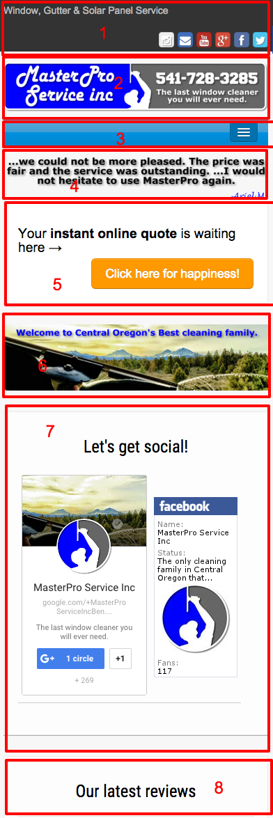
I broke this into 9 sections for you.
Also Im going to ask and assume that the main purpose of this website is to get prospective clients to call you and book appointments or book apppionts your responsiBid?
BY the way you have amazing reviews good for you!
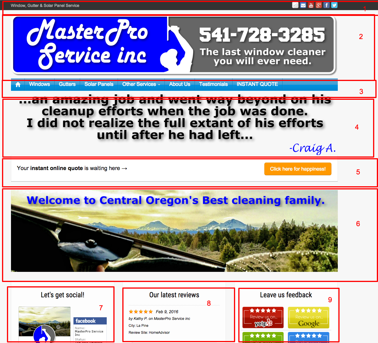
AREAS:
-
Kill the social buttons. Change your page title to say “Cleaning” after window. Put a contact link and your phone # up there.
-
Kill most of the image and try and put the text in actual text and not an image. Its to big. If your gonna keep it push it down to position 3 or 4
-
IMPORTANT bump this up to position 2
-
Kill it or push it down on the page
-
Bump it up - possibly all the way up. The imagery is to big. Use a smaller button around the area of your contact info and phone #. Think about whay people are actually visioting your site.
-
Kill it to big - Find a cleaner way to link to your great reviews
-
Kill it no one is that jazzed to get social with their window cleaner…
-
These are great!
-
Kill it… No one is going to your site to submit a review… The buttons are out dated looking.
Lots of different fonts going on… Semi distracting.
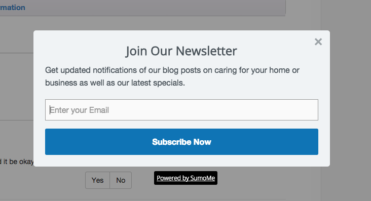
Kinda of annoying… If your gonna keep it use more complelling copy and offer something of value… “Discounts or deals”
Change this page title around a bit. Put your main service to the left of the title. Your company name is the least important part.
Yo
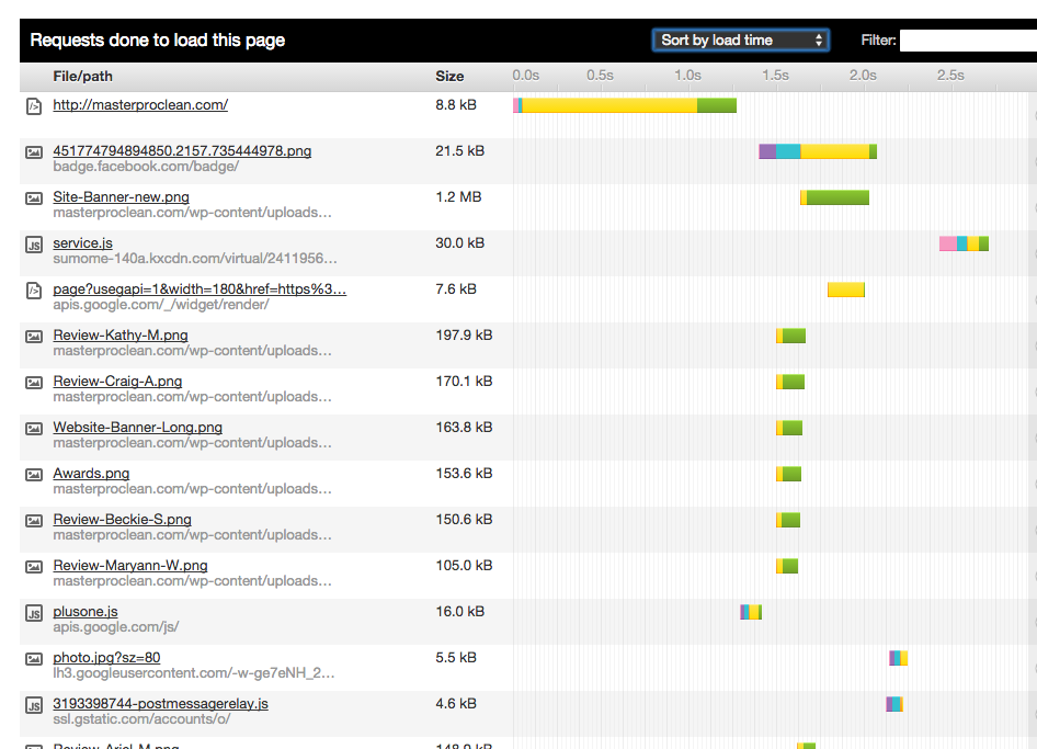
ur page load speed is decent but you could get it better.
Run some of your imagery through this service:
Then upload them.
I was able to reduce the size of your main banner by 50% with it… ( with no quality lose)
Look at the plugins you have installed. Do you need them all?
Your mobile version
Similar feedback to your desktop version…
Check out my site: http://spartawindowcleaning.com/
Notice the persisntent phone # as you scroll?
What do people look up your website for on a mobile device? To quickly call you of course… make it easy for them.
So I hope that is somewhat helpful to you. And again I hope you dont take my critique as harsh.
11 Likes
Awesome thanks for the criticism. This is the stuff I wanted to hear. I’ll see what I can do to implement
2 Likes
Everybody is an SEO guy this time of year lol
4 Likes
For real though, Chris is spot on. I couldn’t have said it better myself.
3 Likes
That’s why I came here. I need to get out of my own “marketing stupid” head. I want to see if I get all your points . . . let me break it down into what I’m hearing
Here’s where I falter . . . I thought I could hit multiple goals with site: I want to really use Responsibid, but also want to build instant trust with prospective clients and build a recognizable brand: eventually cards - trucks - uniforms - site
But it makes so much sense to simplify
Lots of hard work for those
- Got it
- Just a small logo and contact info in header?
- Got it
- Thought this might be a good hook to reduce my bounce rate and build instant trust. Lots of lowball shady companies here, clients tell me stories. What about something like the Ninja Slider which has html base slides rather than just images?
- Understood, what about the button text?
- Got it.
- Understood.
- How do I make them pop? I’m very real here. Every review I have ever received is on the site. Even the 4 - star one. Even the ones that don’t say much.
- Yup.
Fonts - will change it soon.
The email capture lightbox was from a friend in corporate marketing. That’s not my demographic.
Kraken.io will do that soon.
Mobile is tough. I’m limited by the theme it’s all built on. So custom programming or hunt down a new theme and start copying code? It really just scales the text/menu of the desktop page.
Thanks again!
1 Like
That was some awesome feedback from Chris!
I just took a run through your ResponsiBid and noticed some stuff that might be a little off:
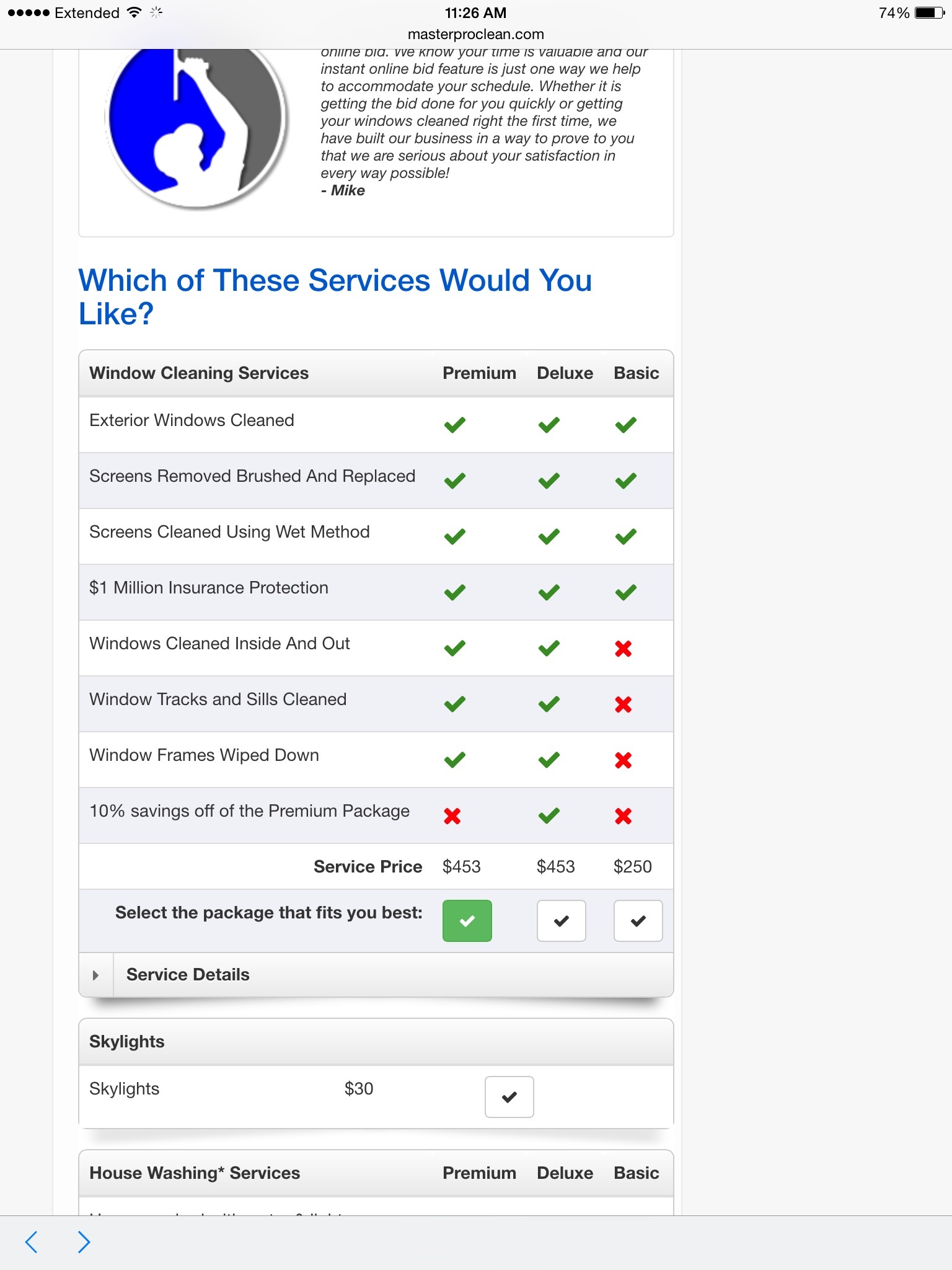
What’s going on with your premium vs. deluxe packages?
Also, do you really get that much for a house wash on a 2 story 2500 sq ft vinyl-sided house? If you do, then mad props. I’d be at $450 or so for the same. It’d be a 3 hour job with my puny pw’er.
Otherwise, you might want to get that dialed in a bit.
Other thoughts on the site:
I’ve heard it’s a good idea to have your name, address, and phone # somewhere in the footer of each page (SEO 'sperts, please correct me if the thinking on this has changed). I also have each service town listed in an expandable list in our footer. Just something to consider.
1 Like
No no I’m a marketer 
2 Likes
I was on RB Basic until last week and no one was using it. I had it stuck on a buried landing page and the call to action button was near the middle of the home page. So I threw it together quickly and didn’t touch it again.
I’m gonna do the install consultation with David next week.
[quote=“Alex_Lacey, post:7, topic:36185”]
that much for a house wash
[/quote] No one does house washing here. It’s the desert. The only thing they want is to get bird poo and dust off the walls just before they paint. And usually the painters do it for free and destroy the windows. Did you notice how “Evil man” the number was? (That was by accident  )
)
1 Like
Sorry to hear that. That stinks ![]()
1 Like
Too much text - the gutter page is perfect the rest made my eyes cross.
Kiss principle: Keep It Simple Stupid.
The reviews were good-can you add video or more photos and cut text in half on other pages?
When i see more than 1 paragraph on a site im done…add hyper links if you want people to read more in depth.
2 Likes
Yeah the plan is to do blog posts and hyperlink to the device landing page
That’s what’s up.
1 Like
Golden nugget!
The social buttons can serve a different purpose. May change the function of buttons to share the content on that page.
Another golden nugget… [quote=“Infinity, post:7, topic:36185”]
I’ve heard it’s a good idea to have your name, address, and phone # somewhere in the footer of each page (SEO 'sperts, please correct me if the thinking on this has changed). I also have each service town listed in an expandable list in our footer. Just something to consider.
[/quote]
Put address into KML file and FTP upload to server will really do the same thing. But whatever.
KML = Keyhole Markup Language
Agreed. Simple and clean will outperform clutter. Focusing on UX will increase your conversions.
Internal links have their purpose for OnPage SEO as well. But keep in mind. Words sell pictures tell. Is your content engaging enough to make the reader not get bored? if not. Use “read more” for sure.
1 Like
You’ve recieved about $500 worth of awesome advice for free in this thread. I’ll add a few tidbits::
- learn to write your own effective copy. It’s not as hard as you’d think.
- run all your copy through the “you” filter. You say the word “we” a ton. How can you say the same thing, but use the word “you” 3x as much as “we”?
-slash and burn your own copy. Puke it all out at once. Then go back and cut it in half. Then do it again. That’s your final draft. - I disagree with Chris on the social icons. Leave them there, they aren’t hurting anything. And they create a subconscious sense of familiarity and stability on the part of the viewer (that concept is a pretty deep rabbit hole though, so no time to cover it in depth here…)
-. But definitely put a clickable phone number in the same area of the page.
- consider just redoing the whole site with a more modern theme. There are a ton of ballin Wordpress themes that are well coded, easy to customize, and can make your site look like a million bucks.
Read a book called “everybody writes” by Ann handley for simple, actionable copywriting techniques.
3 Likes
[quote=“c_wininger, post:15, topic:36185”]
You’ve recieved about $500 worth of awesome advice for free in this thread. I’ll add a few tidbits::
[/quote] No denying that. Now what do I do next? I’ve already started the process.
[quote=“c_wininger, post:15, topic:36185”]
run all your copy through the “you” filter. You say the word “we” a ton. How can you say the same thing, but use the word “you” 3x as much as “we”?
[/quote] Now I thought I’d already begun doing this before making this thread. Where specifically do you see it?
[quote=“c_wininger, post:15, topic:36185”]
I disagree with Chris
[/quote] And this is where it gets so tricky. To some extent I’m reading conflicting info (I also had quite a few comments on my Facebook post.) The difference of opinion. Is that opinion based in fact? Has it been real world tested? Who is just talking out their butt cause they think this is how it could maybe be best if they could do it themselves? Some opinions I know to trust. Others just clutter the thread.
1 Like
i looked a little closer and i think your copy is actually pretty good, just wordy. i think the window cleaning service page is “we” heavy, but the other pages are good. i would consider reformatting the service pages like this:
Quick blurb about specific service, focusing on customer benefit
heading: five reasons to choose us:
-bullet point
-bullet point
-bullet point
-bullet point
-bullet point
one sentence to remind reader of benefit. “if you want more detail, read here” link (to blog post with all the extra wordy descriptions of how you do what you do and why it’s good for them).
that way it’s scannable, a quick read, but the deep info is available if anybody cares enough to read it.
i can’t speak to chris’ opinion on the social icons, but my guess is that he thinks they clutter up the page, distract from the message, and are unnecessary. one thing’s for sure- they will NOT hurt your rankings or slow your page down or anything like that. i think that’s a personal preference thing. you’ll find that a lot of this stuff is people “talking out their butts” as you put it.
the best thing you can do honestly is start doing your own research. there’s tons of info freely available online that will teach you as much as you want to know about web design, marketing, branding etc. there’s a lot of science and research to be drawn upon, if you feel like digging for it, especially in the marketing arena. you can earn a masters in any of this stuff without ever setting foot in a classroom.
2 Likes
I think with a service business you should ignore a bounce rate. In my opinion, a high bounce rate is good because they are coming there for one action. Get the phone # and call you.
3 Likes
Takes a lot of guts to ask that question among your peers. You set your pride to the side and said, hit me with your best shot ! Admirable in itself. It is how we get better and grow. At anything. Constructive criticism.
1 Like
Dude… Your site is sexy as F…
@Chris makes a valid point… This is why I say multiple calls to action and contact info above the fold. I would venture to say I have seen increase in conversions by integrating a contact form into the slider. (Use Revolution Slider in WP if you don’t know how.)
"Want a free estimate but too busy to call? We make it easy for you.
Fill in this form and our service team will work around your busy schedule."
BUT… Everyone has a big butt. Opinions will vary on bounce rate.
It really depends on the traffic generation you are doing. Right now, some say your PPC campaigns quality score can be affected by your bounce rate. So may want to keep it in your mind somewhere.
If you are relying on inconsistent online marketing like organic SEO… Sure… Bounce rate doesn’t make a difference to overall campaign performance. Same could be said if you are only using free traffic sources.
If you want consistency. SEO is so last year. SEO is good for branding and return path. So is Display Advertising.
Search based interest Display Advertising is more cost effective than traditional PPC. Also it has a dramatic and powerful effect during ZMOT.
First off. Value optimize your potential client base.
Choose your traffic source.
Offer a Lead Gen
Offer a Loss Leader
Offer Core Product
Offer Upsell Side Sell Resell…
Then create a return path.
There… Shortest complex marketing post in history.
That right there is the skeleton or outline to any successful marketing campaign. Online or off.
I resemble this statement.
I am not an SEO guy as I have been branded on WCR. I am a marketer. I don’t like SEO, it is too unreliable. I like consistent and proven results. Unlike the majority of the window cleaning business owner community here. I believe you get what you pay for. So I am not oppossed to buying traffic. I prefer it.
Call me a web designer if you want… But I really don’t like the stigma of being something I am not. I sell SEO services if I have to. But I prefer to focus on what makes a sold and consistent ROI. That’s just me. Everyone has their flavor.
