Been trying to get along with photoshop for the last month, amazing piece of software by the way, and since I really fail on the creative department so far, I’ve being using templates and playing around with them to see how my future website will look like.
Please comment, I’m not sensible when it comes to this stuff, so don’t be afraid to speak up
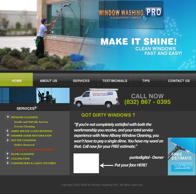
[B]I agree with mhpoole- nice header. Brennon also makes a good point, but of course, this is only your draft. If you have any trouble with setting up your site on Dreamweaver or whatever you use, let me know. But it seems to me you have an idea of what you’re doin’.
I really like what you’ve done so far. It’s very easy to read (has good flow). I’m sure a bit of tweaking like Brennon suggested might step it up a bit.
I bought that template a while back, but never ended up usining it (too much flash)
But heres the thing with SEO to rank Well for a given keyword like “window cleaning katy, tx” for example, all you have to do is more than your competitors SEO wise.
For San Diego, I am competing with other sites that have hundreds and hundreds and hundreds of backlinks (google looks at links to your site as “votes”). Some cities like Portland, OR, toronto, and others are just as competetive. Other places Like New Albany, Ohia (I know this because I was just checking out Brennons site, which is pretty cool by the way) ranks #1 for New Albany Window Cleaning, but he only has like 8 backlinks.
Thats because all you have to do to be on page 1 is MORE that what the top sites a are currentyl doing. If they are doing NOTHING, then guess what, all you have to do is a little more than nothing. 90% of this is offsite stuff, like link building.
Also, just because an area is easy to SEO for, doesn’t always means, there aren’t a lot of people searching, it just means your competitors aren’t optimizing.
Ok, here it goes one more. I’m not sold on any design/layout so far, but I’m always open to suggestions. Please compare with the 1st one and see which one you like better, and if possible, why ?
I think it’s coming along, I think it could stand just how it is, but why not tweak it some more, I assume that the logo at the top is your regular logo and that those are your regular colors. With that said then I would suggest taking the green on the site and replacing it with the orange from your logo so that it all goes together better.
I say that because the logo does not look like it fits with the rest of the site. The font is different and so is the color scheme of the logo compared to the rest of the site. So it looks like it was just pasted on and is not integrated.
If you do not have a set color scheme for your business yet and you can not change the color of the website because it is prefabricated, then I suggest change the orange in your logo to the green on the website. Or ad some orange text on the site to balance the orange in the logo.
I of course am speaking of the first layout you posted which by the way I think is a lot stronger then the second one.
Thanks for the suggestions.
I’m using Photoshop along with dream weaver and some templates downloaded from the web and edited to fit my taste.
Mike, you’re right about the logo, it was pasted in there and it looks just like that.
Both are template based, hence the different color scheme, but again, this is a really rough concept and color can be adjust later on.