Ok…here goes…be gentle…but honest! Haha!..I did this myself as I don’t have the budget for a designer. It was a lot of work and I feel a sense of pride, so it’s kind of scary to open yourself up to negative feedback…but I need it from people who know what works…I want this website to rock!
The pictures if the ugly dude cleaning the windows and the gutter pictures are mine…jobs I did. The others are pictures got from google. I plan to replace them with my own over the next few days.
The reason my domain name isn’t attached to it yet is because I wanted to test out Wix and see if it was a web host I would be happy with. I think I am going to go with Wix on Monday. It’s a pretty user friendly web design system…anyway, what do ya’ll think?!
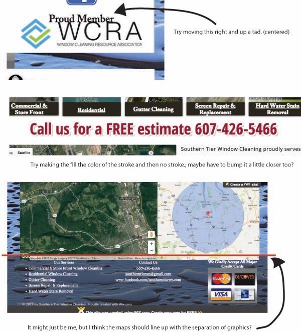
In the upper right the WCRA logo is crowded on top of each other.
Lose the attempt at a drop shadow in the middle of the page.
The map is running a wee bit too low out of place. Maybe shrink it about a centimeter.
I had a thought that the WCRA logo was a bit too big?..and maybe I should lose the “proud member” statement…Which map are you talking about? The radius map or both?.I thought maybe that was too big and possibly should be smaller and fixed on the footer.
Judging from my advertising post cards,I think it has become evident that I have a problem with drop shadows haha!..But I like the idea of the contact info being boldly placed throughout the website…I need to work on the about me and I forgot to caption the screen repair…maybe I’ll put the about me on the home page as well…
I’ll be taking pictures today and tomorrow…I had to get a tripod to hold my camera…I need to find a friend willing to hang with me for a day and take pictures and maybe some video!
WOW…would you believe that my view of that does not even show those issues! haha!..crazy!..I’m still considering putting the maps on the footer…and maybe half the size of what they are now…I’ll play around with it today
Definitely a good start. I would get rid of the shadow drops on some of the fonts. Some of the text goes up to the border on my phone…looks a little crowded…Maybe take out the image as a back drop border.
I’m not sure about the map and your location…kind of confusing. How about for your coverage area map have it on a different page not main page. Also how about a map of counties that you service colored in, instead of a proximity map.