Hi All,
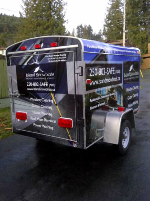
Just got these proofs from the graphic designers, thoughts?
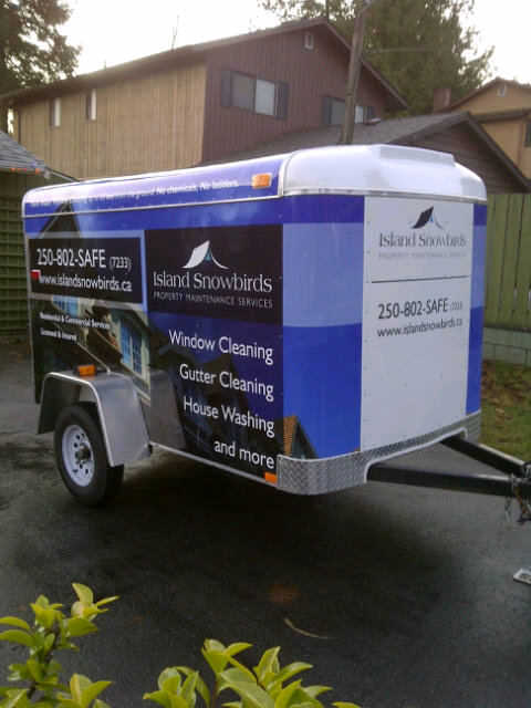
EDIT: end result
I like it. Stands out, not too busy and cluttered looking. Very nice. You gonna do the tow vehicle to match?
I like your headline “pure water cleaning up to…” on the side, but it’s kind of easy to miss… could you make it a bit bigger? Or closer to the center at least. It explains the WFP (to those that won’t recognize it) and the SAFE phone extension so well, it deserves attention. Looks great though, even as is.
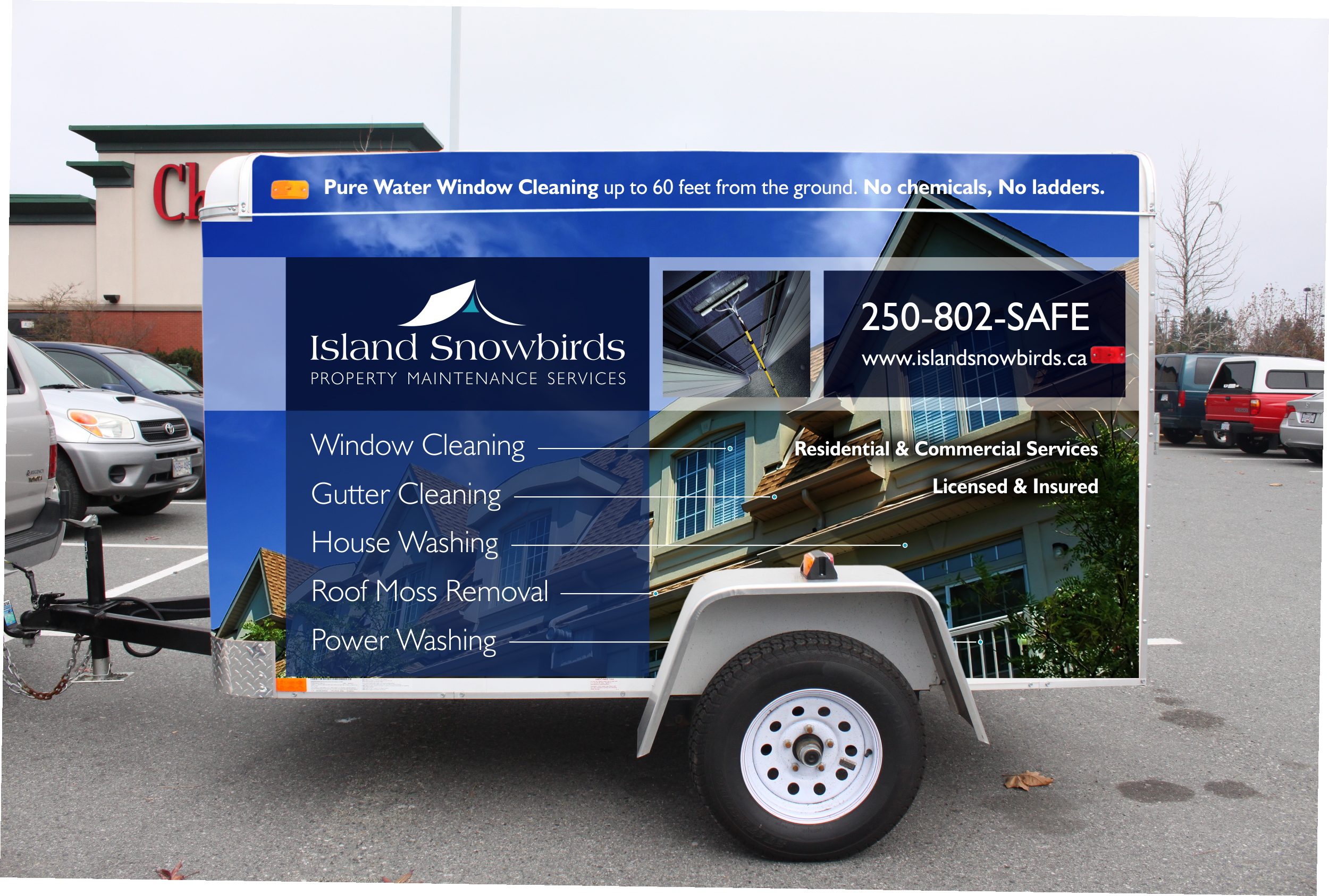
I would lose all of the background graphics - I believe there is too much going on (although it looks nice). If you are having this done for marketing purposes - which most people are - I say stick to big bold lettering, something easily read-able, list your core services in big print, and you can add your other services below or off to the side. Leave the trailer white and just have vinyl lettering installed. It will be much cheaper and more visible. What more could you want?
Of course if you just want something that “looks cool” parked behind your truck then this layout would do the job.
That will pay for itself real fast.
I agree, too much going on. Your phone number and services need to be at least twice that size.
I am here: Google Maps
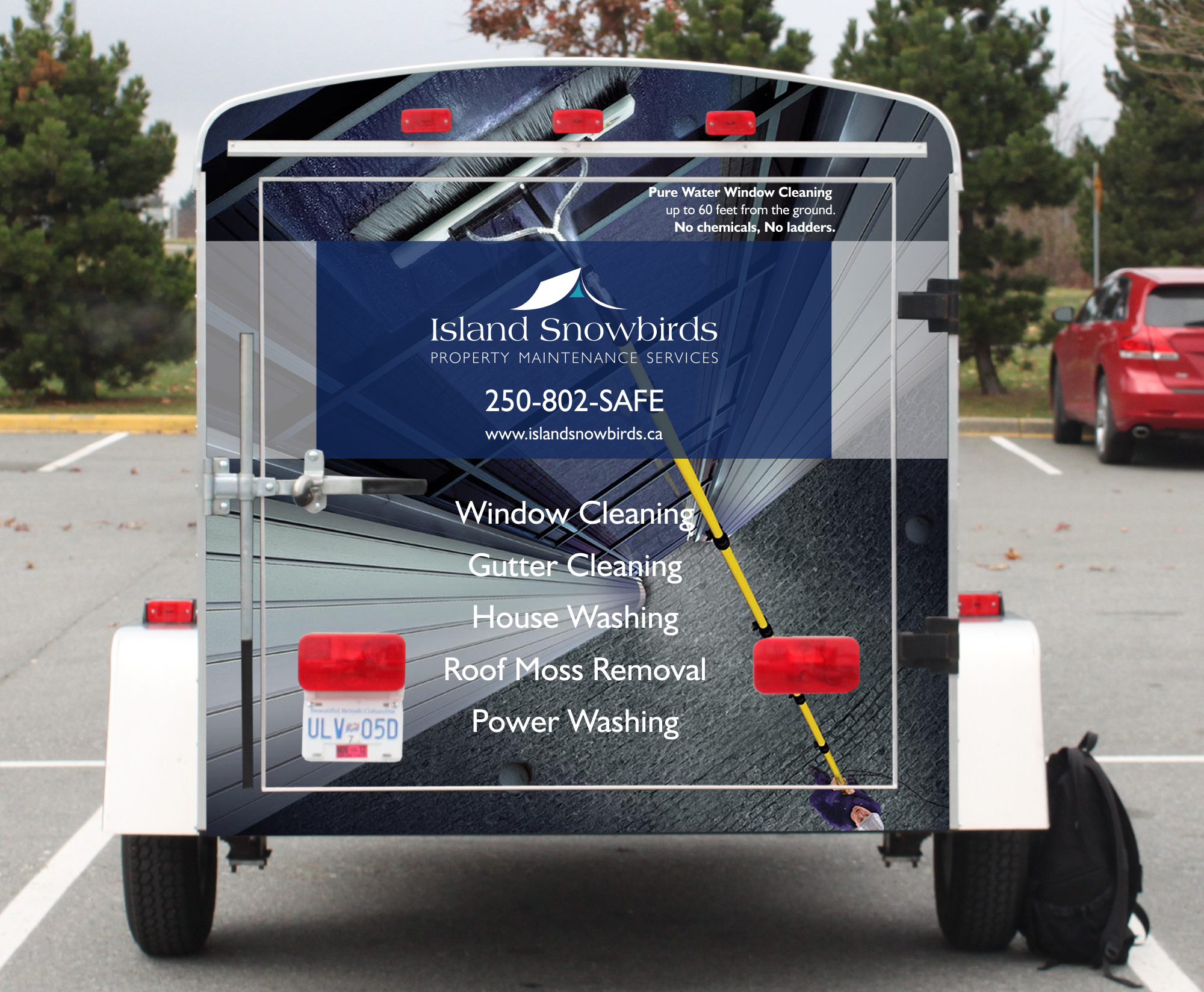
I really like the back door, the only changes im asking for is the contact information to be larger and to also spell out my number in brackets.
The sides I feel is too busy, hard to get the message. While I don’t agree that the most effective way would be cut vinyl against the white trailer. It does make people know right away what your services are, it does nothing to build your brand. I’ve spent years working for the worlds biggest coffee chain (hint: Seattle), what I’ve learned is whats inside the cup is half the battle, what the cup looks like is the second.
Im going to remove the WFP image off the side, as people wont understand that aspect. The contact info will be twice the size and I’m going to drop two services, just focus on the top three.
Do you guys think it would be better to drop the image of the house and just have three large images of a squeegee against glass, a clean gutter and a house being washed?
I think it looks nice but I would loose the lines coming off Window Cleaning ---------- , Gutter Cleaning ----------- etc.
Other than that just make the # on the back BIG and you’ve got a professional-sharp looking trailer.
Thanks
What are the lines for? Increase size of the phone number for sure
It appears to me that the lines connect the service to the area of the home where that service would be done.
I think the lines look kind of funky, I was almost expecting to see prices on the end of the line. Other than that it looks good. +1 for making the phone # bigger.
It might be hard to tell as these are poor quality photos, but I removed the lines as they were confusing for people.
looks good. did you use reflective material?
No, but that would have been a smart idea!
depends how active you are at night.
i think you have the most important thing, a professional looking trailer with a clear message.
Roughly what did the wrap cost?
With tax it came to $1750. It’s a 5x8 cargo trailer.
Very nice. Looks clean and professional. I love it.