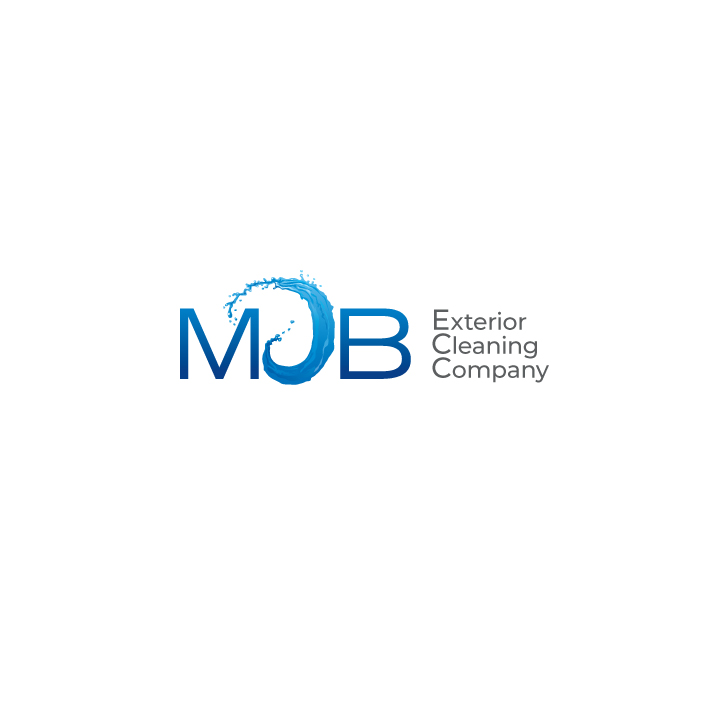
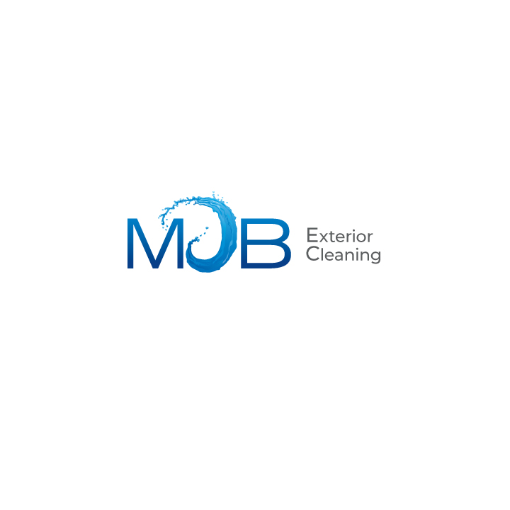
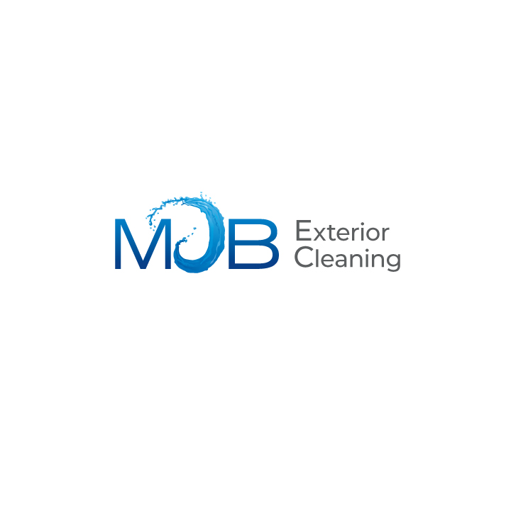
Please let me know which of the three variants you like the best (‘A’, ‘B’, or ‘C’)
Also, please rate the one you chose:
On a scale of 1-10 (ten being you don’t think it can be improved) rate how good it is for representing an ‘Exterior Cleaning’ outfit who hopes to grow into a full-fledged business someday.
Please feel free to post other thoughts.
Background:
Who has spent countless hours going back and forth with a designer to create a business logo?
Sadly, I’m now one of those people. I probably shouldn’t have hired a designer in India.
Anyways, now I can’t figure out which of these versions I like best (I’ve been looking at this for far too long).
I’m not even sure if one of these 3 finalists is good enough (maybe if I tweaked it with another designer it would finish it). I feel disgusting for spending so much time on this.
Thanks to your feedback earlier this year (in the ‘member’s only’ section) I changed my mind and decided to stick with ‘MJB Exterior Cleaning’ as my public business name.
By the way, my DBA name is ‘MJB EXTERIOR CLEANING’ but my official name is ‘NW EXTERIOR CLEANING LLC’. So far, the DBA is what I show to the public.
@chris (who doesn’t want Chris’ opinion… especially on a marketing-related topic?)
I pick C, and I give it a 7. I don’t think you need the word company like in option A, and I like how the exterior cleaning is much bigger.
The M and B with the water is nice and clean, but I feel like I need to see something more relevant to exterior cleaning, like the water shooting out of the nozzle of a pressure washer, something along those lines. I do not know if incorporating more is what you want, so maybe finding a way to make that " Exterior Cleaning" stand out more, really send the message.
Try not to stress, we all know how hard logo design can be. Let your fellow window cleaners and pressure washers here on the message boards guide you as well- they know their stuff.
I saw a big box truck once with PRESSURE WASHING in giant letters on the side. Took up the whole side of the truck. Like a GIANT yard sign with a phone number. Best attention getter I’ve ever seen in over 50 years.
They had company name with logo web site and address on the passenger doors. They were legit.
Thanks for the reply! Wow, your reply says it all. I probably need to re-design the logo.
The wave stands for ‘J’ (my middle initial and part of my business name).
I’ve been looking at this logo for far too long and didn’t realize how the wave is not easily recognizable as a ‘J’. It looks like a ‘J’ to me because I know my initials are MJB but to the average person it’s not recognized.
I knew what it was supposed to be, ‘cause I’m all rainman with abbreviations and initials. But the J is definitely too abstract to be easily recognized by most viewers.
I like C but if I may add a suggestion. It would look cleaner if you brought the height of “exterior cleaning” down to match the height of the “B”. Also try to see how it looks without a space between “MJB” and “exterior cleaning”. That’s coming from a former graphic designer.
I’m very glad that you did not hold back (even though it didn’t give me warm, fuzzy feelings). I’d rather know the truth then be flattered. I also liked your comment on “first becoming great at what you do” before focusing on a great look (my wording). I’ve felt guilty for not following that because I’ve also thought that is the right way to do things. I just hate to spend money on vinyl signage unless the logo is something I feel is worth using.
Thanks, Alex, much appreciated. I agree (now that I’ve received all this help) and can’t wait to fix this.
Very grateful for a graphic designer’s advise and now that you say those two points I agree 100% that these two areas need to improve. Thanks!
Gutter, window, roof, siding, and hard surface cleaning are the primary services. I’m trying to get more into soft washing roofs (my set-up is quite basic and I’m new to soft-washing but I prefer to stay on the outside of homes so I want more roof cleaning and less window in the long-run).
C would be the best of the three, but I really don’t like any of them. I am trying to think of some ideas at the moment in order to provide some decent feedback, but my brain has not turned on yet.
This is my brutal honest review of version C as I have stared at it for a few minutes.
Looking at it at first glance I guess I see M “J” B, exterior cleaning.
The M and B font is very Meh. The J is highly distracting. its just super bold compared to the rest.
I feel like there isn’t much of a flow. No matter where I look at this logo, that J grabs my attention and distracts me. There needs to be more of a flow and match between your Icon, wordmark and “exterior Cleaning”.
Once again, It is not terrible, but if you are in this process of getting a logo done, I would not settle for something that is just, “meh”. I would leave this designer who is working on this, cut your losses, and get new concepts done by somebody else. (Preferably not in india).
Steve, your brutally honest opinion is well received, many thanks! Seems like you’re in this business. I hear what you’re saying about ‘flow’ (it’s like my eyes have opened to see another major issue). I was leaning towards having a US designer take what I have and re-working it but now I’m considering your advice–cutting losses and trying again. That’s hard to accept but it may just be best.
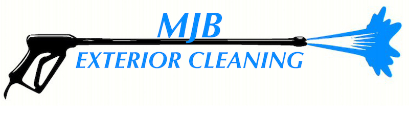
Thanks a lot, Garry, for working up a mock-up for me to consider. I’m trying to convey ‘soft wash’ so I’m steering away from the pressure washing equipment in the logo. Thanks, though, for your kind help!
That’s funny because I’ve had this hypothetical conversation go through my mind many times. Finally, I’m content to lose window cleaning jobs to gain exterior cleaning jobs as I’d rather focus on marketing to roof/siding cleaning. Maybe posting this topic in the PWR forum would have made more sense… I’ve just never posted in that forum.