@Garry hit it on the head @MJB-Exterior-Cleanin I think. The customer doesn’t get the differences between a soft wash and pressure washing. Most people don’t know about the different lifts a mechanic uses, or how his tools work, nor do they care, what they care about is did he do a good job on my car, what he/she professional (and how long did I have to wait in that case too)
Pressure washing has long been the standard for cleaning the exterior of a house, so that is what people will expect to see. Now when you tell them you have something better, safer, etc. Then they can be even more excited, but in order to get them to contact you in the first place, using language and symbols they expect will remove a mental barrier for the customer. All this recognition of what you do has to take place in a second or two, so the quicker they can understand what you do, the longer they will have to write down your number/website or take a picture. I know I have seen wraps and logos that look great, but by the time I got out my phone to take a picture or a note they were gone because it took me awhile to understand what I was looking at. Best of luck!
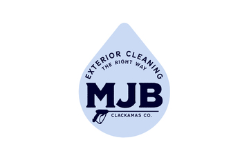
Micah - I must have reads through your initial post too quickly. You were explaining the name MJB. I missed that part so when I first saw your logo versions I didn’t even know the " blue water splash " was suppose to represent a " J ". I thought it was just Art Work of water in between the M and B. Just wanted to add that. Good Luck !
That’s exactly what I needed to know–not a good logo as the splash doesn’t look enough like a J (one of many ways it could improve).
Good point, I think you’re right, but it’s my impression that in my neck of the wood (Portland, OR) there’s an increasing number of people shying away from pressure washing.
I wanted to add (days ago) that when downstreaming (X-Jet) one is pressure washing (1,000 or so PSI) but also with chemical (making the need for 3,000 PSI unnecessary). So, there are different types of ‘soft washing’, I suppose.
It looks like this post is about finished with–thank you everyone for your help!
-Micah
I like C because of the emphasis on “exterior cleaning”. It has a clean look as well.
I would read this as “MB” if I didn’t know better. The top tail of the wave being bigger than the “M” and “B” makes it seem separate, and the curve of the wave makes it hard to know that’s a J.
If all 3 letters are scaled the same, and the top tail is taken off or reduced, I would rate it a 10 because I can’t see anything else wrong with it.
Thanks, Chris, for your honest feedback—I am still trying to decide whether I should start over or have a good designer rework what I have… so I am glad to hear from another guy in my industry. Hope to reciprocate in the future.
I made this video in case I do decide to rework the current design. I’ll post it here if anyone wanted to watch it but I realize this topic is getting old.
Here’s the latest draft from a US-based designer. Eager to hear some feedback.
I find it quite amusing that, after explaining to Garry how I didn’t want a pressure washer in the logo, that my current designer seems keen on using a pressure washer gun. Now that the gun is much smaller, I’m not so opposed to it.
I like it 100x better. Classy, simple, and lends itself well to further simplification for embroidered polos and other smaller branding opportunities. (e.g., a black water drop with white MJB letters)
I could see this logo working well without any pressure wand at all. Just make Clackamas, CO a little bit bigger to fill the space. But just a little bit, like the same font size as “The Right Way” tagline.
Thanks, Alex! I appreciate the quick response, and constructive feedback, as this designer I’m working with is speedy (in a good way).
It’s funny you mention that because the designer has already recommended that the two be separated (‘pressure washer’ and ‘droplet’ being better apart) because otherwise, it’s too busy. I already told him I agreed.
I’m so glad I went with an experienced, U.S. designer.
I’m really loving this logo. “The Right Way” line especially. It just seems well put together and has great touches (the water drop, the color scheme, and pressure washer) .
Seeing this logo I would definitely think this company is a leader in their field. I see it as confident and unique.
What is a MJB? Unless they know you those letters are meaningless. Doesn’t grab even one persons attention. All caps are harder to read than upper and lower case lettering. It looks really nice but it’s definitely not an attention grabber. Unless they already know you, of course. JMO
Mike, that’s exactly the type of feedback that I want to hear, because it challenges me to consider how to improve this logo–I’m trying to finish it.
Yes, I agree, that all caps is harder to read. I should have the designer present the logo as ‘Exterior Cleaning’. Thanks so much for giving me a critical opinion!
I also hear what you’re saying about the meaninglessness of ‘MJB’ to prospects. This is great to consider.
You’re right, it is only relevant to those who know my business.
Let me try to explain: I’m trying a different marketing method that isn’t so attention-grabbing, but rather trying to entice customers (versus having a giant billboard saying “We’ll wash your house!”)
Portland is a very picky market and they appreciate low-key, vintage, attractive branding. Many don’t like the loud ads. It’s a very artsy, unique city. I’m just trying to adapt to my environment.
I also agree that the droplet logo looks better with the previous font, but the problem is I don’t want to give up the other version (with the pressure washer) as a secondary logo and that previous font doesn’t work with the ‘wand’ going through the letters.
So, I’m probably keeping it here–losing the classy, vintage look–and calling it good. Just a little fine-tuning (hammering out the colors) and this should finally be done. Can’t wait.