Sorry, it just looks like words to me, not really a logo.
To me a logo is a graphic image of typography and image. It is missing that which takes a person attention at first glance.
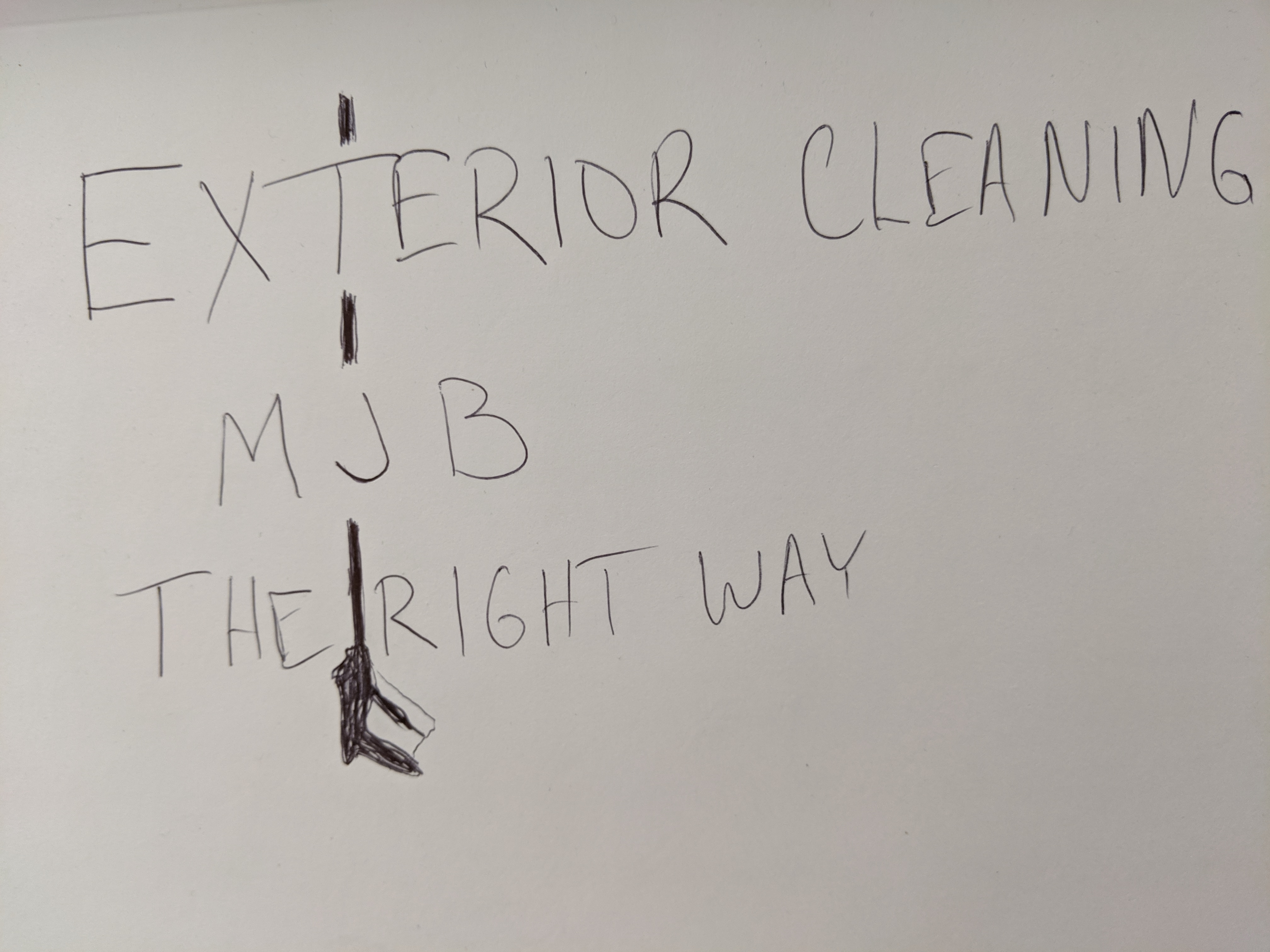
Looking at the PDF, I would say the bottom left is the best. The center water drop thing is horrible. It isn’t a logo so much as it is just text thrown inside a water drop.
“The right way” shouldn’t be a part of your logo. That is more of a tagline and shouldn’t be included in the logo itself. You can include it one some stuff underneath the logo, but to me it really doesn’t mean much. It for sure shouldn’t be the same font weight as “exterior cleaning”.
On the bottom left version…
If you align the “Exterior Cleaning” left and right a little better and drop it down away from the MJB just a smidgen more (and I mean a smidgen), you may be in business.
I am definitely not impressed with this artists work though. There are fine details that they have neglected. Like alignment and spacing. Notice how close the bottom left of the “M” is in that center logo thing? That is just bad design and a lack of attention to fine detail.
Wow, Steve, I must admit that I’m about shocked. I’m stepping back wondering, ‘What’s wrong with my sense of judgment?’ I mean, I could see this being considered ‘bland’ but “horrible”? Seems a bit extreme. Thank you for being so blunt, though. I find this very interesting.
Steve, what’s your opinion of a great cleaning company logo? Would you mind posting some or pasting some links?
I also noticed that it was too close but haven’t said anything. I need to do this.
I hear you, and we’re already planning on a version without the tagline or the ‘Clackamas Co’.
I already told the designer we need to work on the alignment of that very thing. Thanks for also noticing that and sharing.
I gave this to the designer and sketched out something awful (to try and convey what I thought you meant, but I can’t sketch) and he tried a few times and wasn’t able to produce anything palatable. Thanks, though, for the idea, Alex!
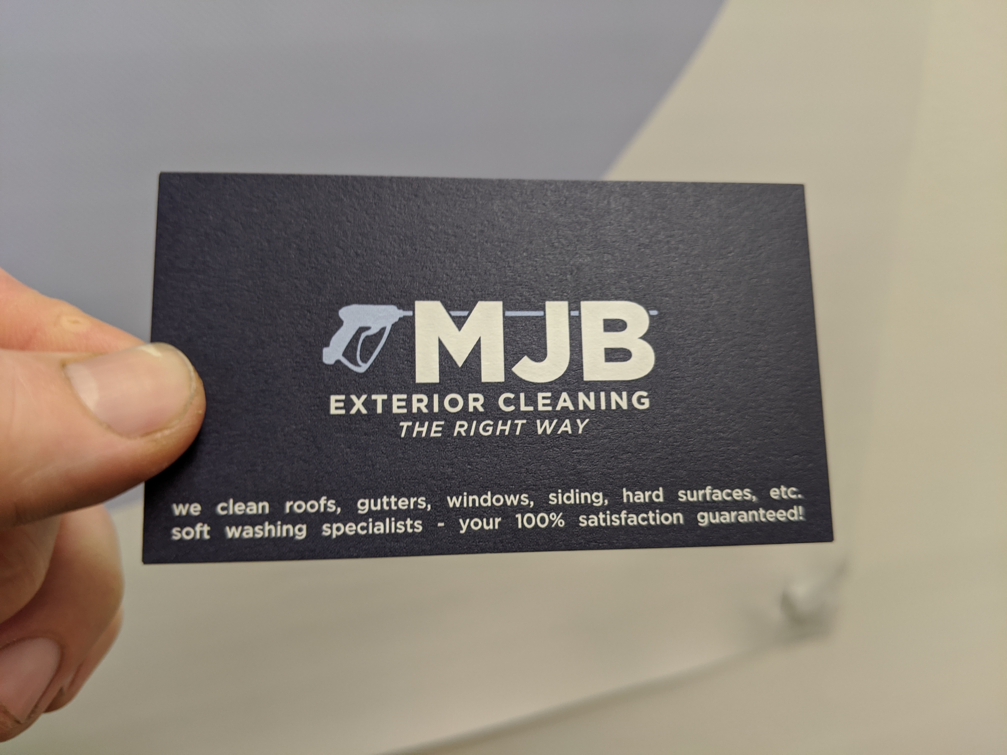
I can’t send you samples at the moment, but what I can say is type into google images “Fortune 500 logos”. Now, granted, they have the advantage of being around for a long time, dumping millions into branding, getting to the point of not even needing words in some cases (think Nike). But if you are at this point, there is no reason to brand yourself as anything less than a fortune 500 or fortune 5000 company. Simple, clean, recognizable, usually 1 - 2 colors, perfect kerning, perfect line spacing, proper alignments, easy to read text, etc.
My current core company is currently going through a logo re-brand. I have had my designer working on the logos for about 5 months. We have roughly 180 concepts. No joke. I have tested it with numerous groups of people and found the top 10 or so. We are currently tweaking those till we find “the one”. Now…this is a bit extreme and I wouldn’t recommend going this crazy, but 2-3 meh concepts is no good.
That Water Drop logo had zero “design” to it., and I am sorry for being so blunt, but it is horrible. The designer who sent this your way should be ashamed of this work. It was just taking the elements that you gave the designer and dropping them into a water droplet. Quite poorly in the process. I would fire this designer and go with someone else.
If you are interested, send me an email and I will give you the information to a great designer who is in this industry.
My perspective:
It’s just that I have been spending months at this logo design already, and after 2-years of business I’m still basically a one-man-show, and I have a hard time justifying dumping much more time and energy into this task to develop a Fortune-500-quality logo. This has been a lot of work and I’m thinking it’s decent enough (considering my industry, lack of capital, and size of the company).
Let me develop a company first–with lead techs, an operations manager, a sales manager, and systems for everything. After that, and I have a great need for top-tier branding, then I can dump $10,000 on a logo.
Let me show you a company who dominates the market here, formerly owned by the now-famous speaker, Brandon Vaughn: https://allcleansoftwash.com/
Wouldn’t you agree that this logo is template and perhaps cheesy? Yet, it was good enough to build a formidable business. Now ‘All Clean!’ is someone who needs to consider a $10,000 logo, wouldn’t you agree?
Anyway, that’s where I’m at–I feel I should first prove that I’m a legit business before developing a world-class logo.
Do you at least think that what’s in the works with my current designer is better than my current logo?
We do not do logo design. But I would refer you to someone who does
.
You don’t need to spend $10,000 on the logo. But you can still follow simple design guidelines that bigger brands follow. That All-Clean is a little cheese, sure, but it looks like a much more established business.
I get the frustration of just “wanting to get something out there” / done…I totally get it. And if that is the situation, then go for it. But it will be expensive to rebrand later on. Think trucks, forms, everything.
While a lot of people don’t judge a company based on there branding, also a lot of people do. I am just one person, but I will tell you that 9/10 times if I see a company, especially a contractor, doesn’t look “established”, I won’t use them. This means that if I think their logo looks like it was done in Microsoft Word, I will not use them. That water drop one looks like that to me, Whereas the “All Clean”, while cheesy, still looks a bit more professionally designed. That is just me, but I can tell you that many people out there function the same way. Branding is very very important.
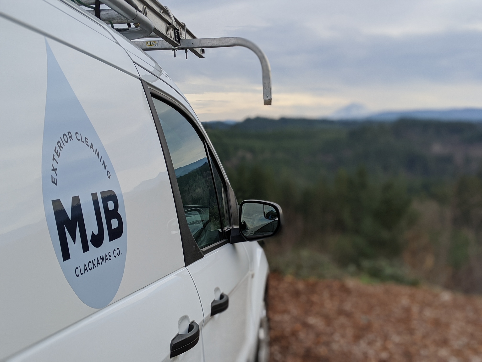
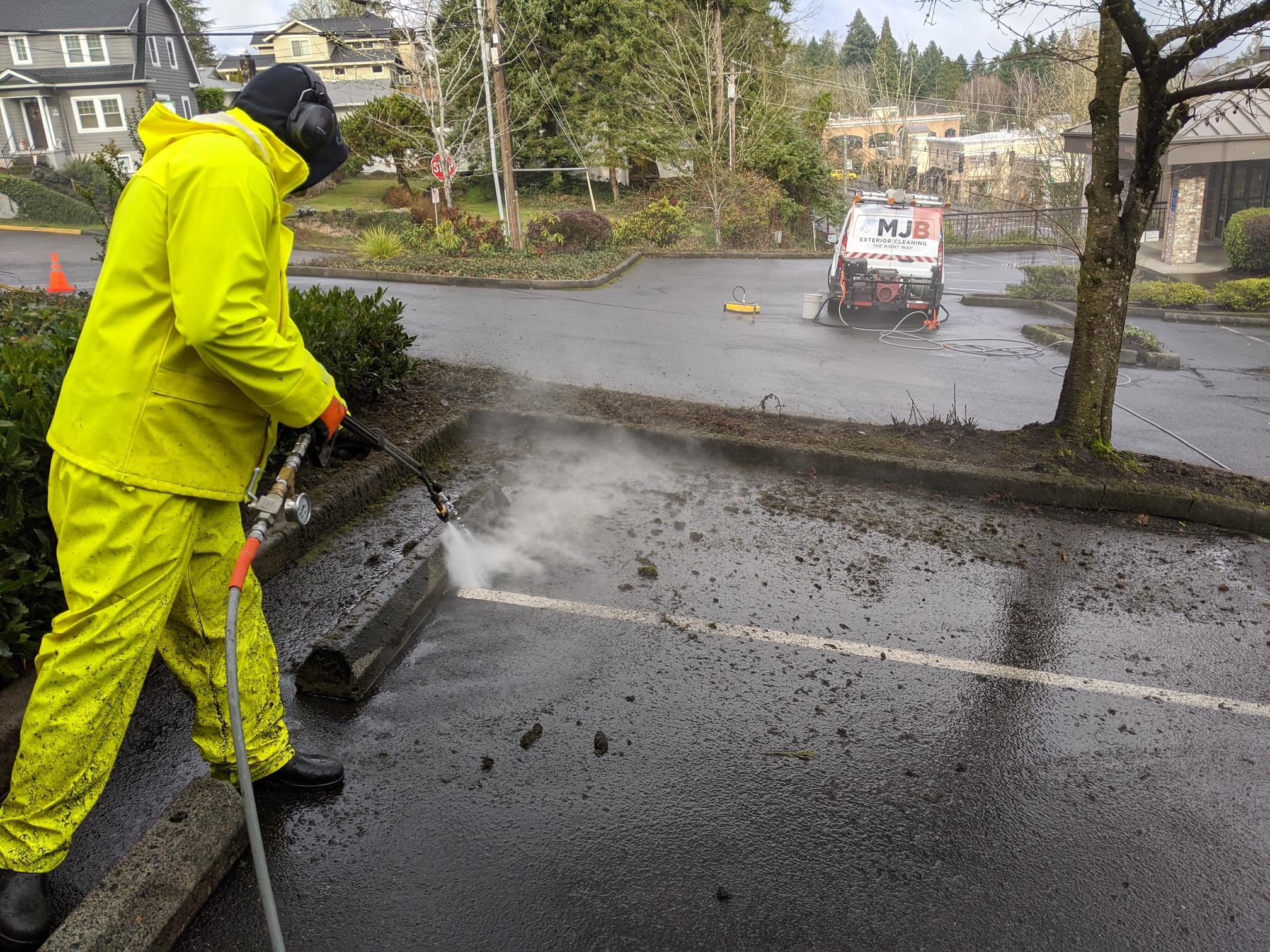
Nope. Keep the gun horizontal, just lower it a bit. Sorry for my confusing explanation earlier.
I agree that the water droplet logo is a bit lazy, and there are some small details that shouldn’t have been overlooked. But I can’t help myself - I still love it.
Right, I’m trying to simply have a logo that makes me look established. I’m hoping that this logo will do the trick but I’m glad you’ve let me know you don’t think so.
Very thankful for the forthright, critical opinion. Thank you, Steve, for all your time on this.
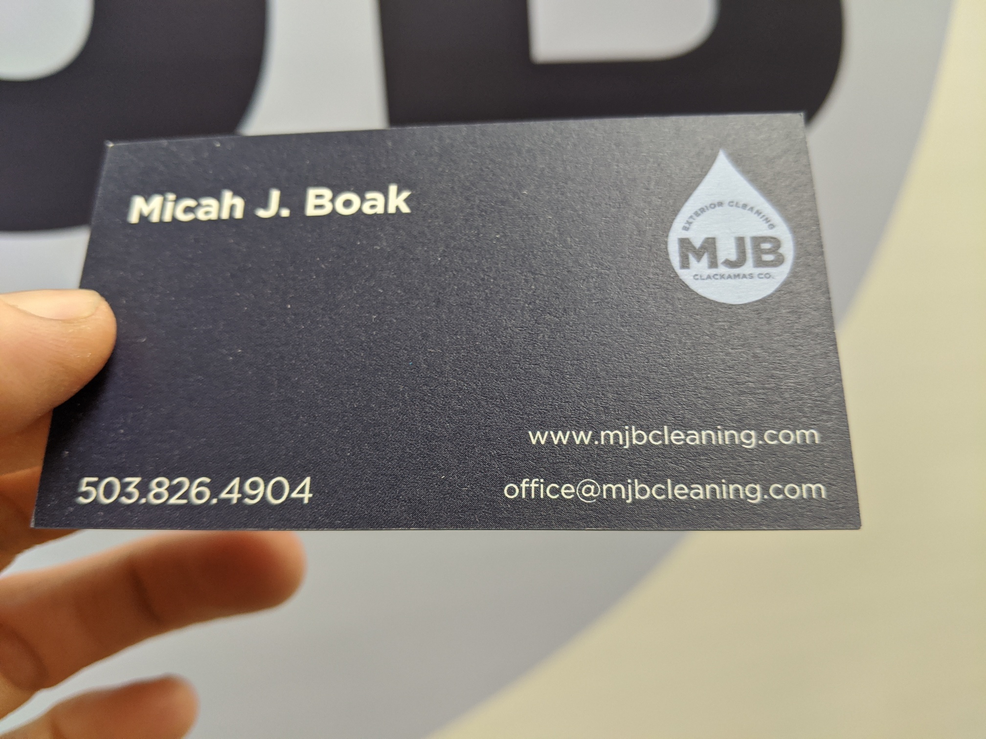
Leave your name and initials out. Stay low key.
Think of a name of your company.
Say what it is you do.
One comment said huge name and phone number.
I agree. That’s how my truck is set up. The thought is, can someone driving by me read my number plus see what I do in seconds. People are distracted by everything these days. Make it big and get to the point. Hope you do well!