I’m guessing how is similar to mine. Thwyre 4inches talk by 3inches wide. Went ahead and cleared cache and still the half screen
1366 X 768
The menu area that travels with the site takes up almost half of my web page LoL
If it’s convenient could you please post or pm me a screen shot?
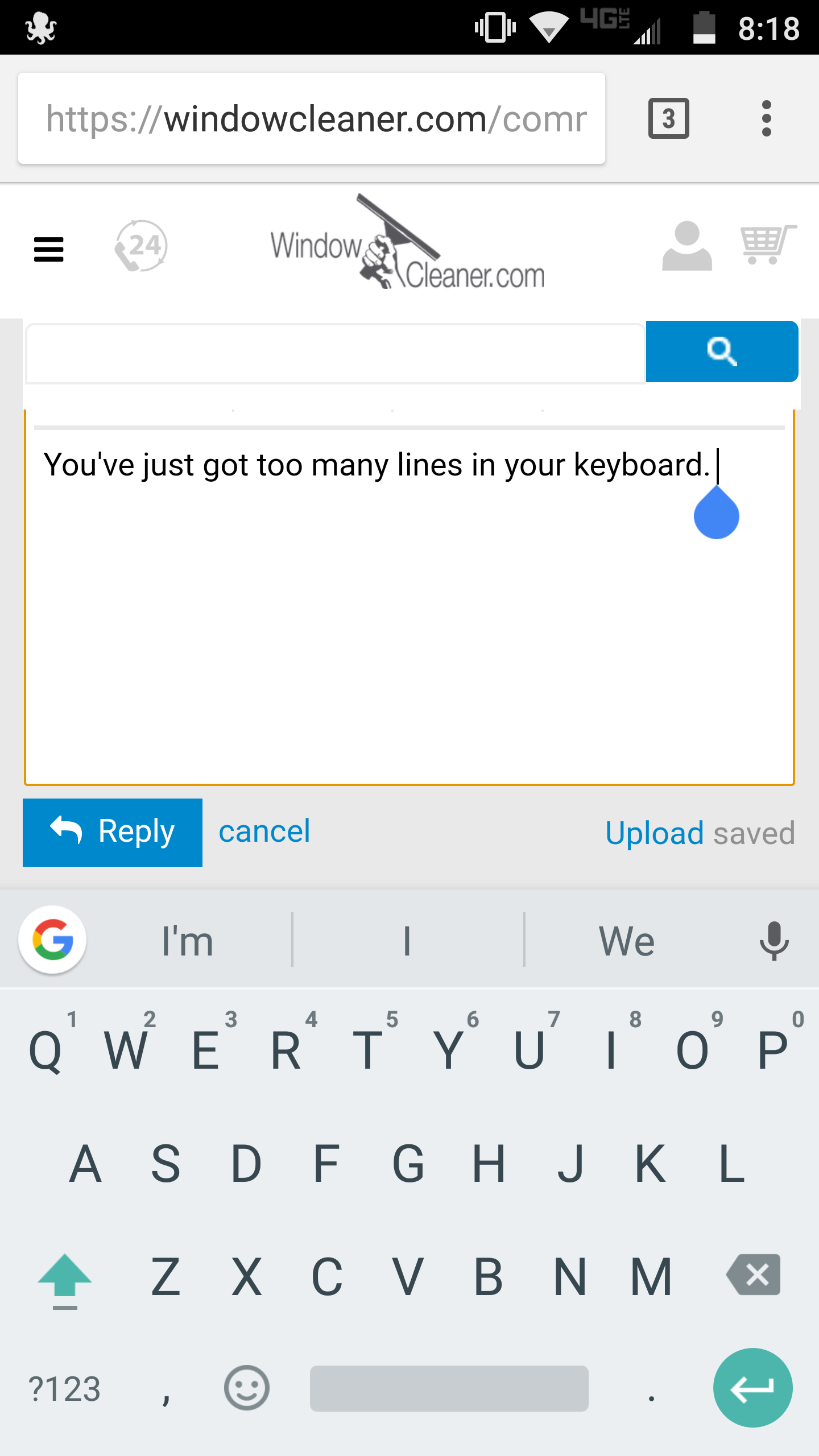
You keep your keyboard envy to yourself, mister! 

But yeah, seems to work well on my iPhone. My galaxy is for my day job so I probably shouldn’t be in WCR anyway. 
2 Likes
Hi,
I have a Samsung S4 emulator and I cannot reproduce the issue - but I tried to introduce a new CSS rule which should show the reply area over all the other areas under most circumstances.
So try clearing your cache, reopen the browser, and see what happens 
Cool. I’ll try it tomorrow.
1 Like
Hi QPM - that is because the larger navigation (the same you see on a Desktop), will be triggered after 768px in width. So bigger screens will have the default, larger navigation.
If you rotate the device in portrait mode (and maybe clear the cache in some browsers, even though it should not be necessary) you should see the smaller navigation.
By George, I think we got it!
2 Likes
Haha, that’s great! Keep us posted for any issue.
I was having that issue with my S7 too…seems to fixed now.Thanks chris 
1 Like
Excellent!
2 Likes
Chris not sure if this is related to the changes, but starting a few days ago i can no longer quote text. As soon as i highlight it and remove my finger from the screen, it unhilights. This is on my samsung galaxy s6 edge and note 5. Works fine on my nexus 7 tablet and pc.
1 Like
i like seared steak…well chicken too and pork, vegetables, yeah i like seared stuff especially on the bbq
1 Like
ok WHO THE HECK is MAGNETICAT???
and why are they sad???
1 Like
